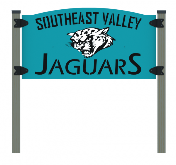
Merger Mascot
Here’s some renderings of a sign design created to help with a school’s districts merger and subsequent name and mascot change.
I did not design the jaguar face, one of the schools’ art instructor did. It looks great, but was a challenge to convert to laser-able geometry. Some features had to go.
Black & White
I struggled with how to stencil the spots in a way that may be sturdy enough to stand up to the elements for a reasonable number of seasons, yet still fits the overall aesthetic.
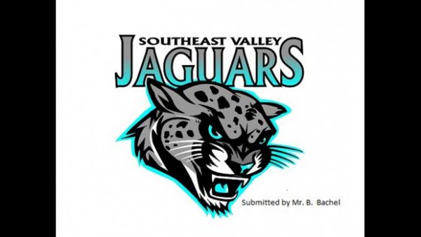
Here’s the original logo:

In order to turn the image into something more binary and easier to trace in SolidWorks, I had to cajole some pixels in GIMP. Here’s what I ended up with:


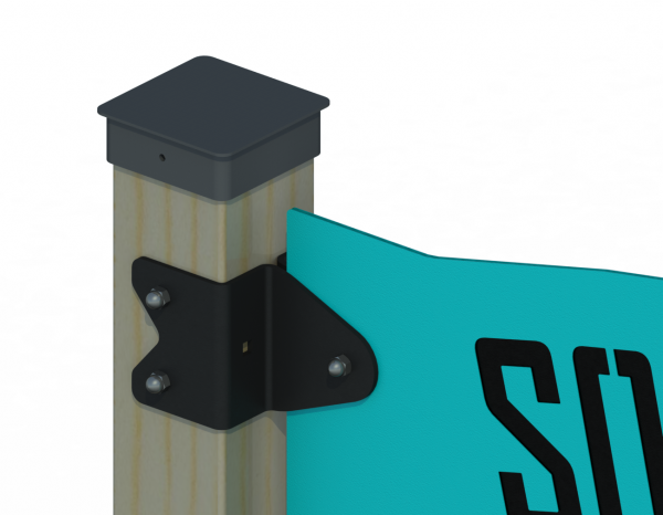
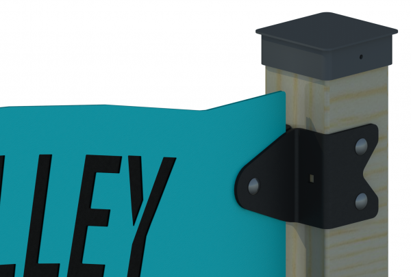
Hardware
As designed, all fasteners are stainless steel, with carriage bolts and acorn lock nuts to make them look extra fancy.


Fonts
I could not find the original artist’s font for “JaguarS” anywhere, and I spent an inordinate amount of time looking. So I went with these 2 fonts.
The top was chosen because it’s compact and looks maybe even better after I added some stenciling (not all fonts take stenciling well…).
The JaguarS font was chosen because it’s really one of the closest I could find to the original, even though that’s got serifs and the one I chose does not. Stencils are added to strengthen or complete the letters.

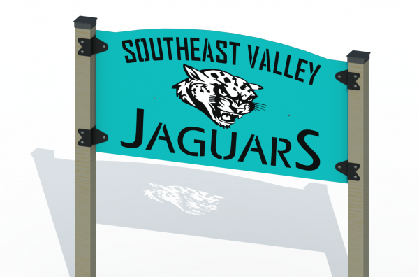
Front to Back, Side to Side
Notice how the cat face cutout in the front & back teal plates line up perfectly with the cat stenciling in the middle black plate, but the writing still goes left-to-right on the teal plates, no matter which side you’re on? I suppose I could’ve done a better job of centering the cat’s chin so it would be directly above the “u” in JaguarS on both teal plates… But then the cat’s ear will start creeping too close to the top lettering.
Yes, I exhibit a psychotic break with reality when it comes to some details that no one else cares about. Steve Jobs turned this uncompromising meticulousness into dying a billionaire. Is it too late to unveil my big idea about a touchscreen pocket computer slash phone?

Fat Cat
The outer (teal painted) plates are designed with 14ga plate steel in mind.
Because of the intricate stenciling on the inside sandwich plate, I thickened it to 11ga.
The 8 bent bracket plates are 1/4″ steel.
The sign lettering reads correctly on front and back, which is why I opted to do the sign this way–no tacky mirrored text effect then, like “REDRUM” in The Shining.
But even with my weight reduction attempts of using thinner-gauge steel, the 3 sign plates and 8 brackets still add up to hundreds of pounds. The plates are 48″ tall, 96″ wide, to give some perspective on how large the sign actually is.