What are these Logos & T-Shirts for?
I coached a team of 6 Jr. FIRST Lego Leaguers this year. They were but one of 3 teams that all met in the same room, each team of 6-ish kids at a different table, separated mostly along age/grade lines.
We met one afternoon per week after school for a few months and worked toward goals of introducing and creating interest in engineering concepts, successful team interaction, and specifically; building a Lego project that fit into this year’s JrFLL theme of trash management & recycling (2015-2016 WASTE WISESM Challenge) and met these criteria:
- Use a Lego battery-powered motor to compel a machine that demonstrates at least one of the 6 Simple Machines (Lever, Wheel & axle, Pulley, Inclined plane, Wedge, Screw) to move “trash” pieces (also made of Lego).
- Everything in this demonstration model must fit within a 15″ x 15″ Lego board.
Been there, done that, got the T-shirt.
It was a lot of fun, and I wanted the kids involved to have a T-shirt to remember the experience and reinforce the teams. Unfortunately we dropped the ball on getting that project done while we were still meeting. But I think we’re going to get it done now that we just finished the season.
Early on, all 3 of the teams had a branding session, complete with building consensus on a team name and logo elements. The kids drew ideas down on their sections of a large piece of paper. Then we found common ground and built from there.
I turned our teams’ logo drawings into a computer-aided graphic. But the other 2 teams didn’t have a Dad who dabbled in graphic design, so I finally got around to creating designs for them too, based on their drawing sheets.
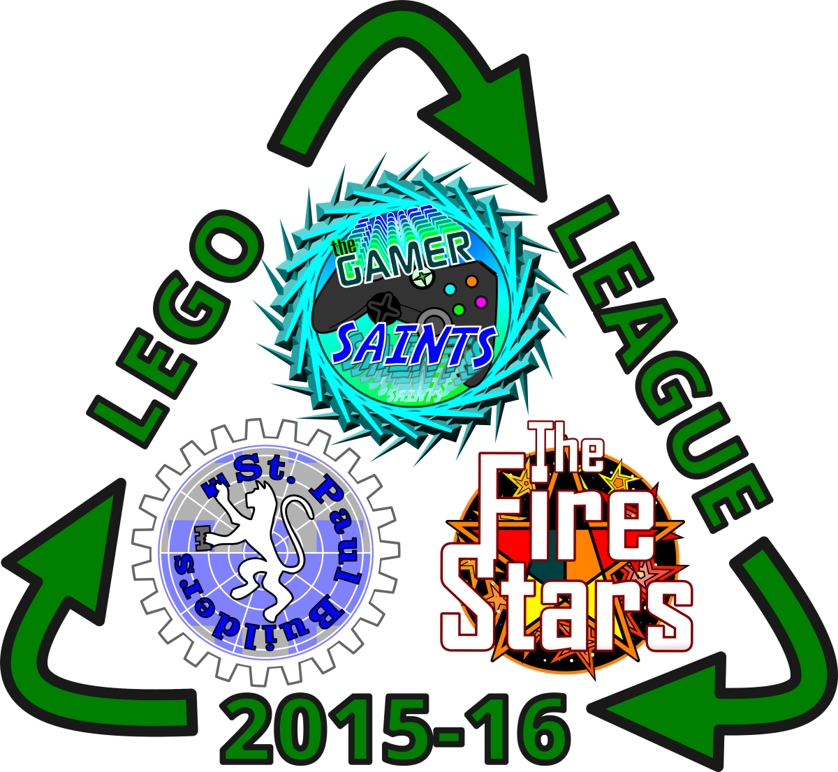
An idea was floated that, if we’re going to make t-shirts and make the order as inexpensive as possible, we should put all 3 logos together into a Superlogo, which could have an added benefit of creating more cohesion among the teams from our school (like if we went to one of the Jr. FLL state meetups, everyone would wear the same signage).
Team Branding Sheets
Team St. Paul Builders
My team was “St. Paul Builders”, and I told that story here. I kept forgetting to take a phone pic of my team’s logo sheet, which you’ll see for the other teams below. So here’s just an update of a gear-themed logo I made to fit in with the other logos (they’re all round-shaped, and will fit together well in a Superlogo).
Why a gear? We used a lot of the gear and pulley Lego when we were coming up with our Final Project model, so the gear theme seemed appropriate.
For a nice video tutorial on how to make gear shapes in Xara: https://www.youtube.com/watch?v=NhxFvaETkgQ
Team Fire Stars
Here’s the logo sheet for the team that decided on “Fire Stars” as their team name. I was told they liked the star drawing best, with the colors used, out of all 6 of the ideas on the sheet.
Team Gamer Saints
Here’s the logo sheet for the team that decided on “Gamer Saints” as their team name, and I was told they liked this controller drawing best.
I was almost finished with the logo when I accidentally made a weird shape in the graphics program. But I liked it and tweaked it and used it as the sharp, pointy border in the finished version below.
Uniting the Logos with a Theme
Here’s the the triangulated logo scheme we talked about for the t-shirts. After I arranged the 3 logos into a triangle, I tried to think of a way to unite them, which was going to just be done by writing “Lego League 2015-16” on it. But then I thought of how the theme this year was trash management and recycling related, and drew green arrows in a triangle shape.
It’s most likely going to be printed on gray t-shirts, thus the light gray background shown in one version.

Here’s a PDF version (vector graphics).