This Ain’t My First Rodeo (Sign)
This post is about some signs I designed over the course of a few years for boosters of an annual rodeo event and its facility. Actual fabricated versions may have turned out differently.
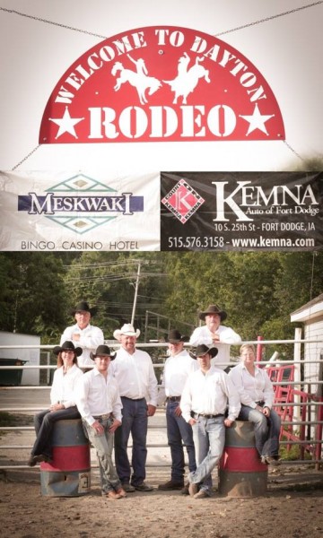
On their website, there’s a photoshopped image of it in pictures, and in one it looks like it’s being suspended by a chain.
From Dayton Rodeo Website:

Design Considerations
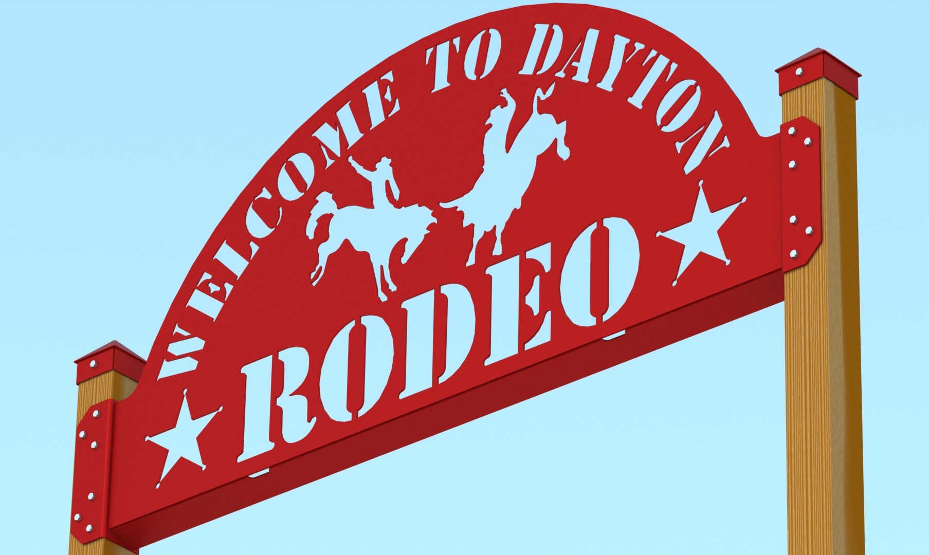
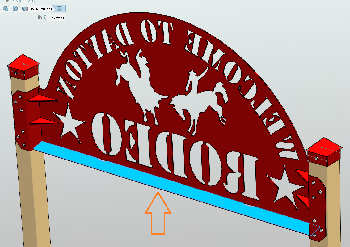
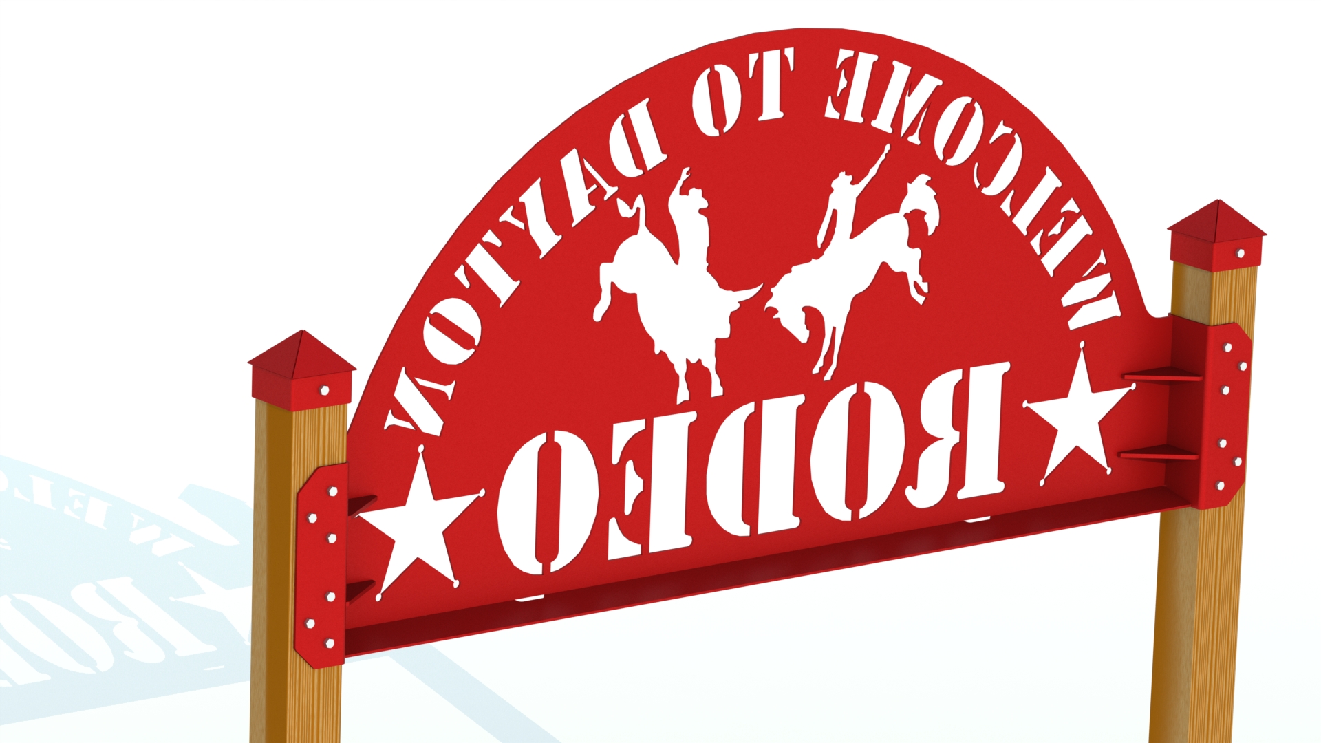
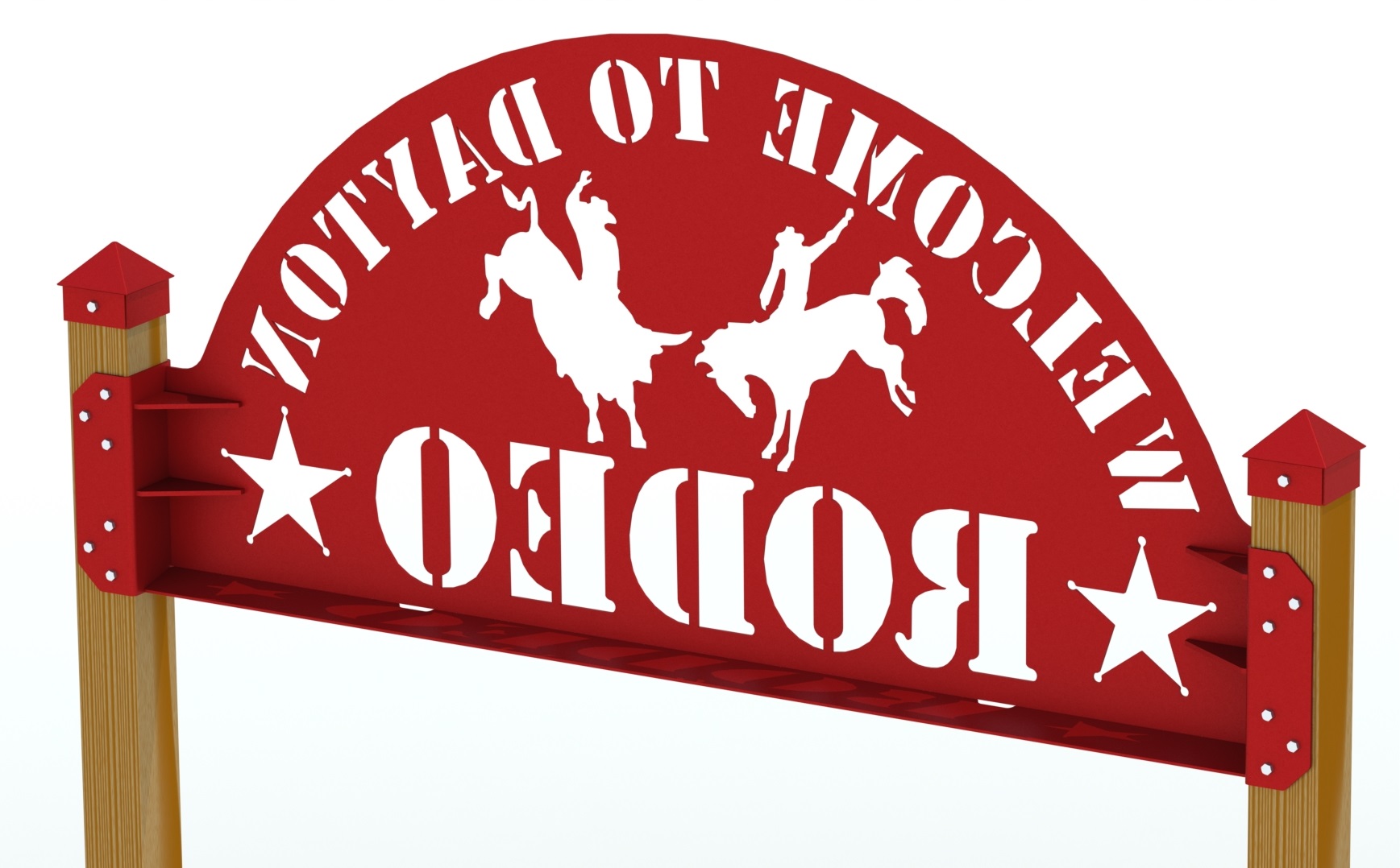
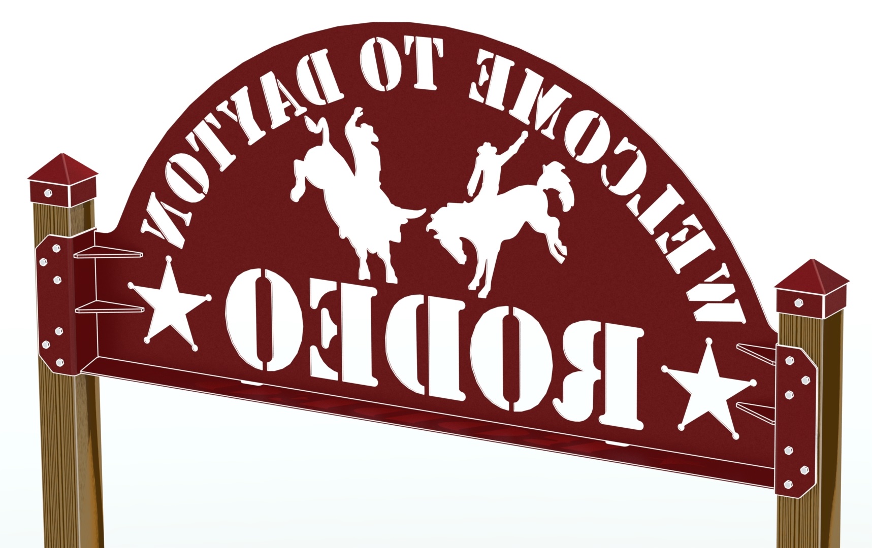
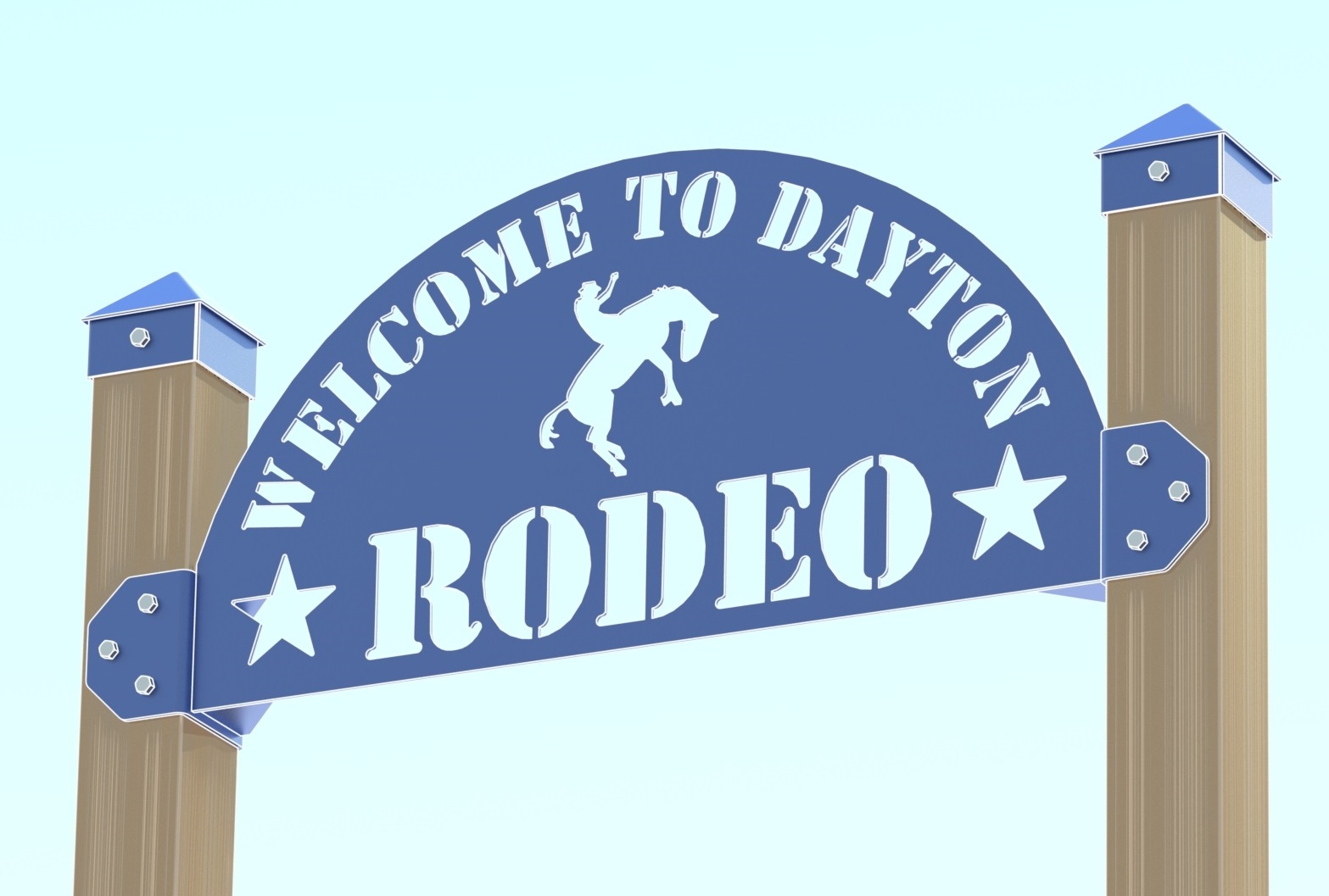
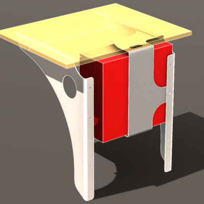
Notice there’s a couple different sign ideas here. One is the oldest version (with just a bronc rider), the other single-plate design came later. Then came the welded, post-mounted assembly idea.

Landmark Signs need to be designed for longevity…
Weather is a killer, and the elements will rot your sign out and make it look shabby in no time if you don’t design for it. Signage, by definition, sends a message. Don’t make your message “I’m tired and neglect details.”
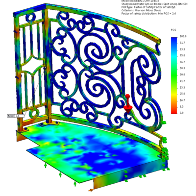
The post-mounted sign design is large, with much material lasered out, so I added a rib across the entire bottom edge in the weldment to stiffen it (with weep slots, to discourage rainwater accumulation, and angled so as not to be mistaken for an empty-beer-can shelf). There are voids from lettering and pictograms for wind to blow through the sign, but in this design, it’s fixed to posts just at the bottom corners. The rib would counteract the wind forces that could be applied to the top, turning the large sign surface into a lever, rocking and wearing against the fasteners and post lumber over time.
The pyramidal post caps are purely decorational, although they may keep moisture out of the endgrain of the treated posts, if that helps.
Life Cycle:
I’m trying for a 35-year life cycle before scrapping due to weathered wood and rust. if such a sign were wire-brushed and painted occasionally, the weldment could be shot-blasted and powdercoated again when the posts wore out, and remounted. This sort of sign is style-generic (no branded fonts or logo that will date the sign when changed) that it could serve as long as stakeholders would want it.
35 years goes by pretty quick, but a nice, simple greeter sign can become a familiar landmark to visitors. If the event and/or facility name doesn’t change, it can be a very inexpensive asset (amortized) for multiple generations, incurring minimal maintenance costs.
On the other hand, many institutions change names with new ownership, mergers, rebranding, or whatever. And that’s if they manage to stay in business for generations.
Still, a Great Value for Signage:
So some businesses change names. So maybe the idea for saving money on signage for decades doesn’t hold as much water as at first blush. But the real point is that signs like this are pretty inexpensive anyway.
Inexpensive… while also looking classic and high-end, because they’re clearly custom-designed & tailor-fabricated installations. Add one of these to a little landscaped island on a property, complete with nighttime point lighting, and it creates a broadly- and visually-appealing framing of a namesake.
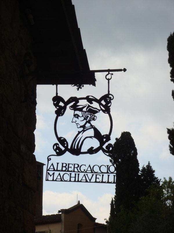
Machiavellian Signage
But there’s more than just the striking, memory-searing branding of a bespoke signage installation. There’s something else there too, something psychological. It tells the casual passersby and potential clientele that see it: This is a business that plans on sticking around in the community for a while. It’s not some vinyl sheet held to a storefront with rope. It’s not an interchangeable plastic tile in a stripmall marquee. It’s a steel and wood sculpture that was purpose-built; crafted for announcing the importance and location of this particular service provider. It creates a mental picture worth a thousand unspoken words (or at least this next paragraph):
…If they thought enough to manifest a landmark-of-a-shingle, they may invest enough thought and effort in their services to develop repeat customers and referrals. They apparently plan to be supported by the community enough to put down roots and add to its aesthetic.
Okay, if you just read that, a few things:
- Seems like I’m laying it on thick with the internal monologue bit, right? A little presumptuous?
- Agreed! But I don’t know how else to articulate a thought process that we’re not even consciously aware of. Marketing production is more art than science.
- All those sentences seem an overly rationalized interpretation to describe fleeting emotions a person feels for milliseconds.
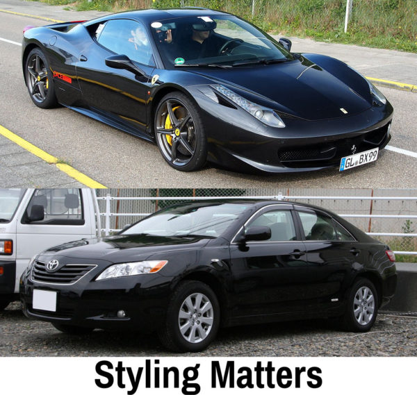
- Agreed! But the fact is: we get impressions when we see and experience styling. Styling matters. It’s why Ferraris don’t look like Camrys. A Ferrari’s styling inspires (manipulates?) a mental story about high-value, unique experiences (elite status), fulfilled desires, etc. A Camry’s styling inspires a mental story about dependability, adequateness, affordability, etc. Styling is a communication!
- Styling affects us and drives choices. Like the decision to become customers of an establishment–in part–because their unique sign caught our eye… We thought it was noteworthy, tasteful, and now we’re comfortable with their style.
- If you’re comfortable with and approve of someone’s style choices, you’re more ready to take a risk on their choices as a service provider. If Ferrari makes good decisions on body styling, they’ll probably make good enough decisions on interior, powertrain, and the overall experience. If a shop or facility has an attractive exterior, maybe their products will be equally rewarding.
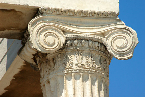
Styling: Because No One Remembers a Plain Column
Signage remarkable enough to make an impression helps assert “brand awareness,” which any marketer will tell you is necessary for sustained competitive success of an enterprise. And the reason I described attractive signage as “Machiavellian” is because I think of styling as manipulative. Styling is often completely unnecessary to Function. An Ionic column can support a building without the fluting and acanthus leaves. But a plain column does not inspire a person to take a picture of it. So if you’re going to get signage, get some with real style so it sticks with people.
This type of sign isn’t appropriate for every small business or facility, you know who you are and if it is. You’re probably a unique location or store (not a large chain… unless you’re looking for architectural signage to meet a local building code). You offer custom services or products or other experiences. Unique services require unique branding, including signage.
Contact me if you want a similar design for your business.
(Warning: CAD stuff ahead)
Renderings:
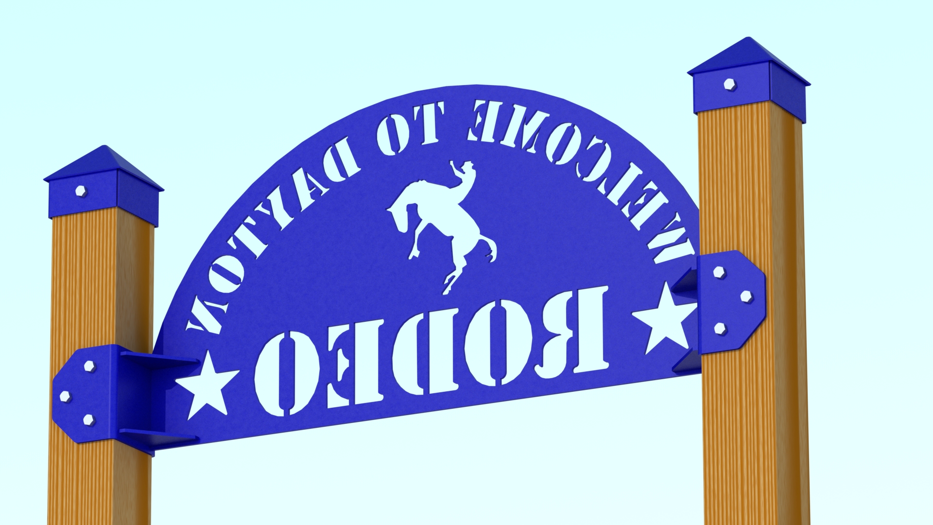
Cartoon Mode?
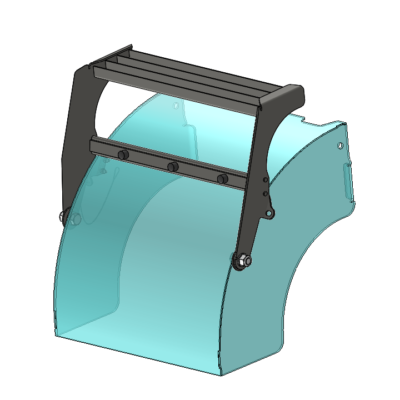
Anyone using the “Cartoon Mode” to rendering? I’ve been noticing it more in product documentation–today, coincidentally–while looking up hardware, I saw this on the EMKA catalog. Notice the white lines in addition to the heavy dark outlines. Not sure what CAD package they use, and maybe they don’t call this “Cartoon Mode”.
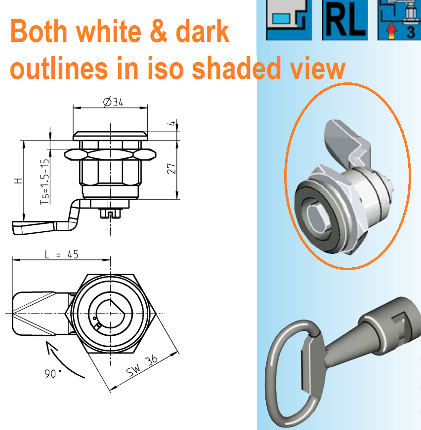
When I first saw Cartoon Mode in PV360, I thought it was kinda gimmicky; [Inner Monologue: Rendering is for PhotoRealism!]
But I’ve evolved on that point as you can see the renderings with the white outlines. Hey, there’s an allure to the stylized graphic art of it; it’s an actual rendering with refined edges and high-resolution (not a pixelated screenshot). In the end, it’s about getting a vision across, and sometimes having high-contrast edges and textures communicates that vision best. Or so the Emka catalog would have us believe.
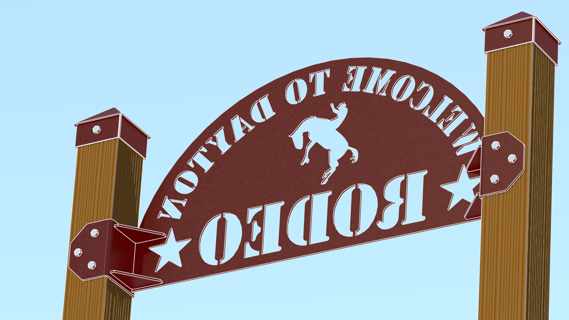
Beware the Fog
Watch out for that “Fog” option in PV360… a couple renders I liked at first got tossed later. Looks like the camera lens was smeared with enough vaseline to shoot a soap opera flashback.
Prints:
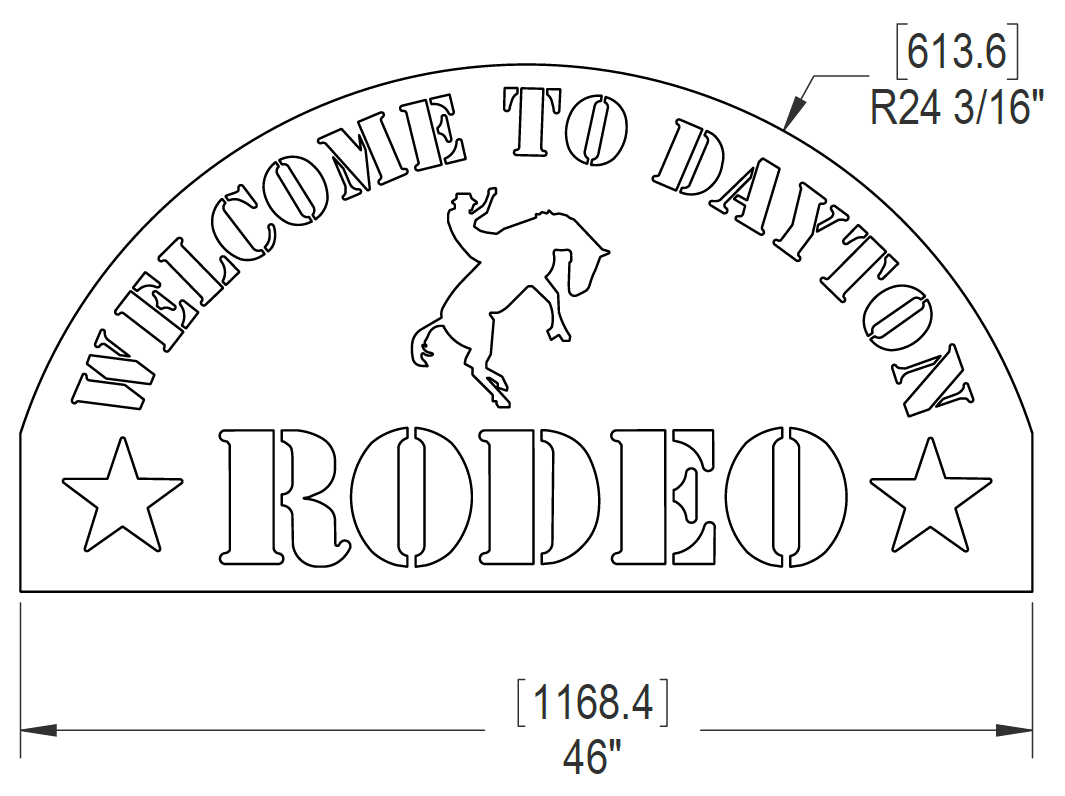
Various Part, Fabrication & Assembly Drawings with BOMs
Assembly print includes installation instructions.
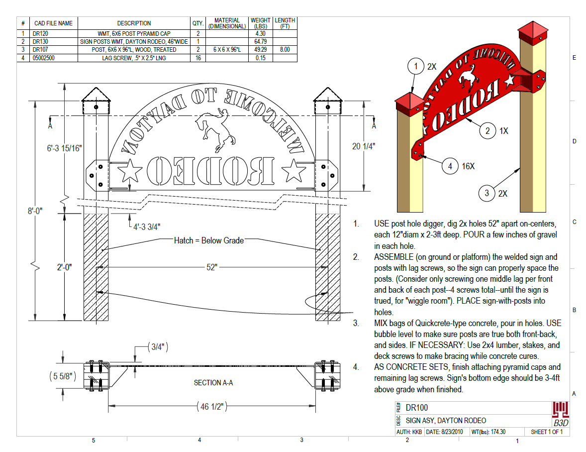
PDFs: Click links below to see the print files.
DR100 – CAD Drawing for Rodeo Facility Sign
DR120 – CAD Drawing for Rodeo Facility Sign
DR130 – CAD Drawing for Rodeo Facility Sign
DR102 – CAD Drawing for Rodeo Facility Sign
DR103 – CAD Drawing for Rodeo Facility Sign
DR105 – CAD Drawing for Rodeo Facility Sign
DR106 – CAD Drawing for Rodeo Facility Sign
DR107 – CAD Drawing for Rodeo Facility Sign
DR110 – CAD Drawing for Rodeo Facility Sign
DR111 – CAD Drawing for Rodeo Facility Sign
DR112 – CAD Drawing for Rodeo Facility Sign
05002500 – CAD Drawing for Rodeo Facility Sign

Leave a Reply about how this blog changed your life.