
Project started when a new business owner wanted branding language graphics and logo assets.
Empathy
I was given a Post-It note with the 4 words to be written in a circle around the Hand/Heart and Work Van graphics. Then the sample graphics were emailed to me.
I was immediately happy to work on this project because they wanted the word “Empathy” displayed prominently on their main branding. I’ve long thought empathy needs to be highly valued in a democratic society, but feels like it’s in too-short supply. So anything that promotes the ideal of putting oneself in another’s shoes to try and understand how the world looks from their point of view is good in my book.
Originalize
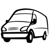
First, I did a Google Images search for the graphics to see if they were copyrighted. The van graphic was found on various pay clip-art sites, so I made a new version from scratch, different enough to be original.
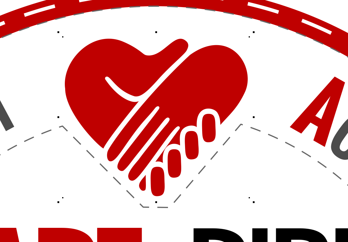
The heart/hand image was not found anywhere that it could be construed as a protected asset, so I made a vectorized version of it without much radical change.
Iterate iterated iterator iteration iterationist iterationalism
You can see how I iterate, copy, iterate, copy until I’m happy enough to show some samples. That’s my process when it comes to designing branding graphics–ya just gotta start, the first version isn’t going to be the best version. So copy it and try the next idea, then copy that and start the next idea.
Feedback
I always learn so much about the specialities of each business I make a website or branding for. And one of the things I learned here is:
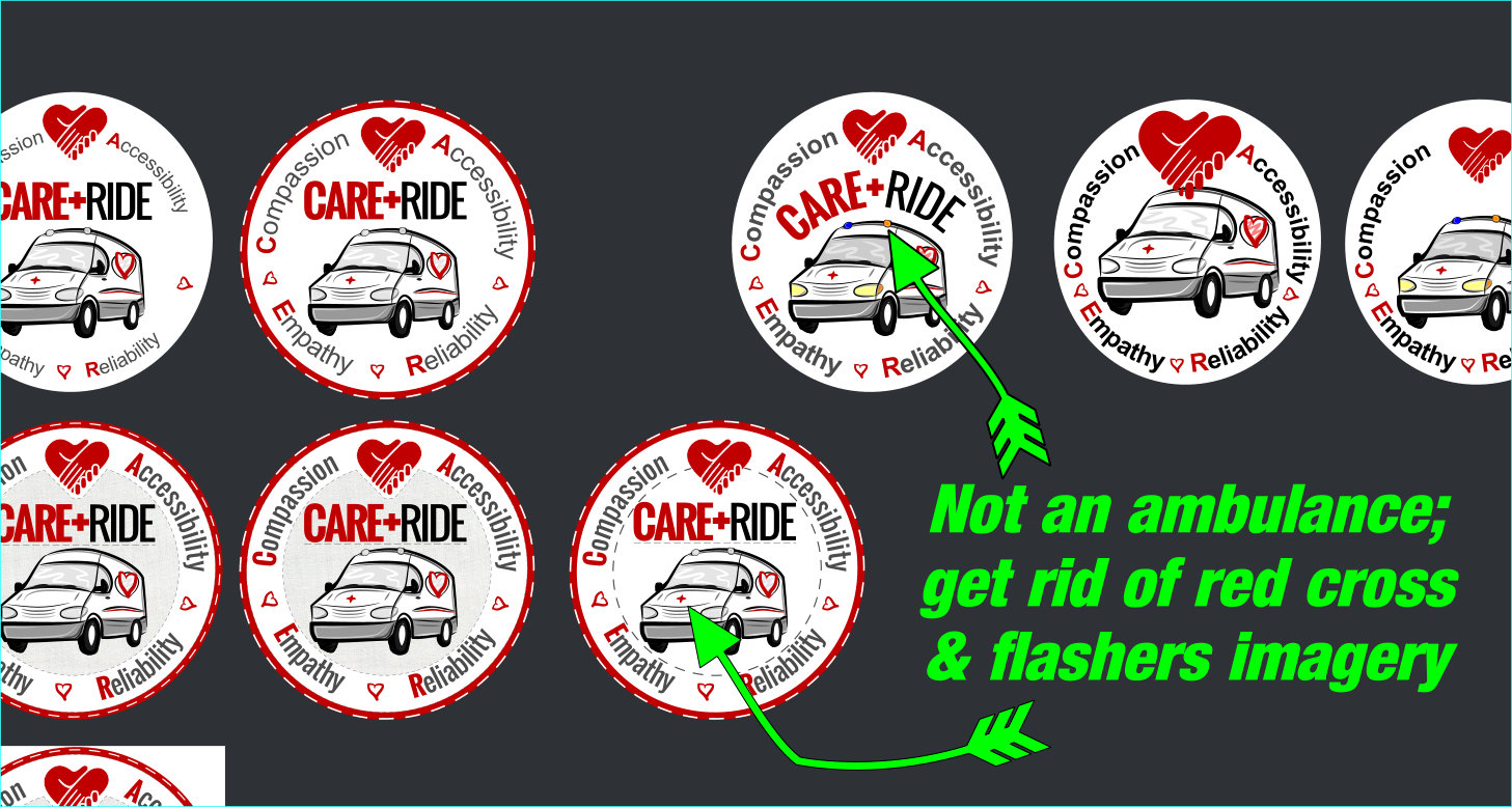
This Business is Not in the Ambulance Business.
So let’s not let on or presume to portray it being in the ambulance business in any way, because that’s a very important distinction. Who knew? It’s little rules and standards and subtleties like that which keep humanity interesting. So the red cross and flasher lights had to be removed from the van.
Variety, Versions, Other Brand Language, Favorites
I’m going to post a few galleries now, to demonstrate the product of my process.
Variety
First, notice the different samples I made for the client to choose from. Some are so subtle as to wonder what’s the difference… it may be one has a faint underline under text and the other doesn’t. Still, details like that add up and are perceived.
A Side Note on Design Style
BTW, I know I overuse(?) the dashed line options in graphics programs, but every designer has that quirky well they go back to draw from again and again. I see it in every online graphic designer/illustrator’s portfolio. For example: maybe every graphic is minimalist line art with mostly 1 uniform line weight, butt caps and mitered corners. Another artist might not consider a logo finished until it’s got a Photoshop mask to make it look as if it were hastily silk screened or ink stamped. Either way, it’s a Design Style.
My personal graphic design style compels me to find reasons to turn solid lines dashed. Especially if I’m thinking of “stitches” (like my wife’s sewing & crafts business graphics, or in this case, a double entendre: medical stitches AND this has a first-responders’ uniform’s shoulder patch theme that would have stitches around the perimeter). Or if I’m thinking of a map theme, I feel like cartographers use a lot of double- & triple-dot-dash lines. And in making infographics, it’s easy for me to consider them as “maps” to understanding concepts, with all sorts of connecting lines, arrows, and “grouping box” borders.
My favorites: Colored versions
I like the ones with gauze backgrounds. I don’t think that’s very practical, to incorporate raster imagery in logo or branding artwork, which should be as vector-y as possible, IMO. But I still like it, and think it would fill a perfect niche to display as the little square avatar image on the corporate Facebook/Twitter/social media accounts. It would look good in pixels vs in print is what I’m saying.
The reason one of them was saved with square white background is because sometimes you’ll have a web platform or other situation where the background is an unflattering color and shows through the clear pixels.
I also like the last color one, which is very white and doesn’t have an underlined company name. I think that’s what the client decided to use for most of their printing. It’s the cleanest and “flattest” version, and projecting cleanliness when you’re in the medical biz is the smart take, I suppose.
Versions
Why do we still care about black & white in the age of high definition television? For years now, when making a graphics project, I try to make graphics that will either print just fine in grayscale. Or, after the favorite(s) are chosen by the client, I make Black & White versions of it. This can do at least 2 significant services for the client:
-
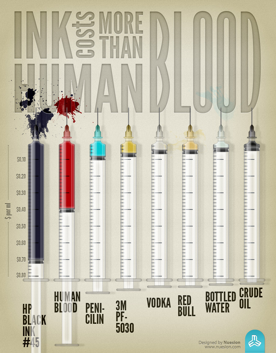
It can save colored ink.
Seriously, ink is often priced higher than its equivalent weight in gold. Or by volume, it’s priced higher than human blood (I didn’t say ‘worth more’, just more expensive at market rates).
Recently, as if to prove my point about how saving ink is a legitimate concern for small business owners; I was in a work meeting with a vendor rep who often preps documents in his home office. He brought some email printouts to go over a project checklist we’d been kicking back and forth and the blue print that Microsoft Outlook default-colors replies in was so faint as to be illegible–and that’s because the rep’s corporation had a blue logo that would eat up the cyan cartridge in his printer! The blue logo is prominently displayed on all letterhead and quotes he prints! (I’m not sure why he doesn’t just print everything grayscale, but a lot of people don’t).
Always the Professional:
So if you put your 2-tone or grayscale logo on your invoices and letterhead, you’re less likely to start doing that thing where your printout text looks fine, but the logo looks sketchy, faint, and unprofessional.
-
B&W or Grayscale may look best for certain media.
If you take out an ad in a paper, trade pub, flyer, yearbook, candybar wrapper, billboard, bus side, television, etc., you may find B&W or 2-tone or grayscale–or whatever the kids are calling it today–will render best in that medium. Perhaps the printer or ad salesperson will even ask for certain versions and file types because they know their business and want you to look good so they’ll look good and you’ll more likely repeat engage.
My Favorite: Grayscale Logos
I don’t like the 1st one, it’s too light. I like the 2nd one though, to the point I don’t think a whole lot is added by introducing red, although I still like the color version better.
Other Brand Language Assets
I feel these are still within the branding language I created (though never documented or truly crystallized–hey, I wasn’t getting Walmart money to churn out design guides!)
I wanted something else to add value to the project, something that may be used for other branding and marketing goals, like putting the image on giveaway fridge magnets so the phone and web URL could be prominently displayed in the homes of repeat customers and their friends and caretakers. Put a stack in each Care Ride van and hand them to every rider when you drop them off. You know how fridge magnets are–get one of those in a person’s house and they’ll be there for generations. How can you afford NOT to employ such cost effective marketing campaigns?
These could also be used illustratively as assets to supplement a blog post or mailer or just to create brand awareness through deviation from the main logo imagery–sometimes all it takes for people to reconsider an identity is to have it presented to them in a slightly different styling. This is why Detroit spends billions rolling out new styles of the same models–(hopefully) all the sudden a whole new audience will turn their heads and think ‘hmm…that’s interesting. Maybe that’s for me.’