Plus: Branding Iterations, Biz Card Design Tips, & Opinion on URLs in Print Marketing
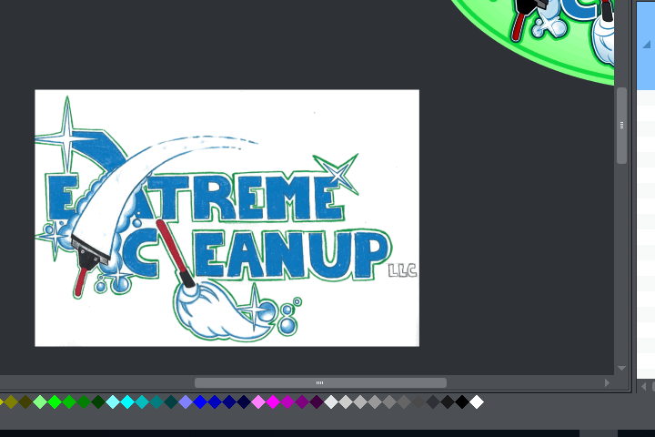
“Extreme Cleanup” owner Nestor knew what he wanted the startup company’s logo to look like. So he drew, scanned, emailed it, & I turned it into a vectorized graphic.
Design Concept
Here’s what Nestor drew up. You can see he had a solid design concept here, with:
- Tools of the trade
- Cleanliness symbols, like sparkles and soap bubbles
- “Fresh” colors of blue, green and white like you might see on a laundry detergent label
- Motional strokes (of the squeegee and mop), conveying vigorous cleaning activity with all the sparkles and bubbles teeming in their wake
With a concept this fleshed out, I don’t have to think much, just process it into digital form and then iterate from there.
Tracing the Scan
I imported (or pasted) the scan into a vector design app so I could start tracing over it with vectorized lines and True Type fonts.

Other Logo Topics Tabs
Click tabs below for more info.
Why care about Vectorization?
So the logo can be scaled and exported without looking jagged and pixelated.
Example: A PDF is often a vectorized document, which is why many PDFs can be zoomed in up to 1,000% and the letters are still crisply outlined. If you try that with a bitmap scan of a textual document, you’ll notice the letters get blurry or pixelated when you zoom in.
Why care about having your logo and branding artwork in scalable form?
To keep your branding looking professional at various sizes.
For example, if you want a logo to be part of a vinyl van wrap, it’s going to be blown up large. The graphics or signage company that makes and applies the vinyl wrap artwork will probably create the best-looking results if you can give them vector files (like an Adobe Illustrator, SVG, EPS, or PDF file). Or just give them a large, print-quality raster image (300 DPI or Dots Per Inch), like a JPG or PNG file that you or your graphic designer exports in hi-resolution from a vector file.
From van wraps to t-shirts to coffee mugs, you’re going to want high-quality images that you can always export pixel-perfect when you own a vectorized version of your artwork.
Early Logo Iterations


As the digitization took shape, I exported raster versions of the work as I tried different things. Here’s a slideshow of early versions I saved as I was considering morphing the mop handle into the X in “Extreme”.
Testing
I dialed in the digitization of the basic elements of the scanned logo, and then started A/B testing myself on whether I liked this border color or that, this outline thickness or that, this many and sizes of sparkles and bubbles or that… here’s a slideshow of various iterations in chronological order, from versions without background ellipse to with.
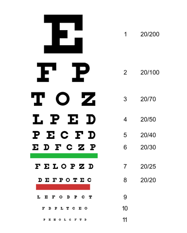
This process sometimes reminds me of being at the optometrist’s office, when you’ve got the lens apparatus up to your face and you’re reading the chart with the big E as the top line, and the Dr. asks “Is it better this way? Or is it better now? This? Or this?” It’s usually just a test of one single element’s attributes at a time, so the change can be isolated and evaluated appropriately.
Design Iterations on Logo
Business Cards
Click tabs below for more info.
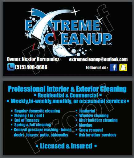
Nestor sent a proof of the biz card he designed, which is well-worded and spare of unnecessary description. So I reused that information verbatim. I made some iterations of the card because I wanted to add some icons to the back and try a different layout on the front.
Indicating Social Media or Web Presence on Biz Cards: Keep the URLs
I’ve worked on a few biz cards in the last few weeks, and it’s reinforced my opinion on how to represent web properties on them: Keep the URLs spelled out. This is especially important if you think your business will gain from acquiring followers and online interactors; give them a way to find you!
I feel this way because there are times when I try to find a business on Facebook or Twitter through the search bar, because they’re doing the minimalist thing of just showing a Twitter icon on their card. The problem is: there are so many results that are close in name, but not the business’ page. When there are 2 billion FB accounts, there is going to be a lot of false positives. I understand having a lot of URLs listed on a card looks cluttered, so just list the most important few, or just one website that has clickable links to other important sites.
Getting as minimalist as possible with printed URLs
My wife ties a business card-like tag to boxes she ships her handmade dolls in. She had me turn it into an actual business card recently. She wants to buy 500 at a time, inexpensively, as opposed to till now–buying specialty printed stock every 100 dolls she sells.
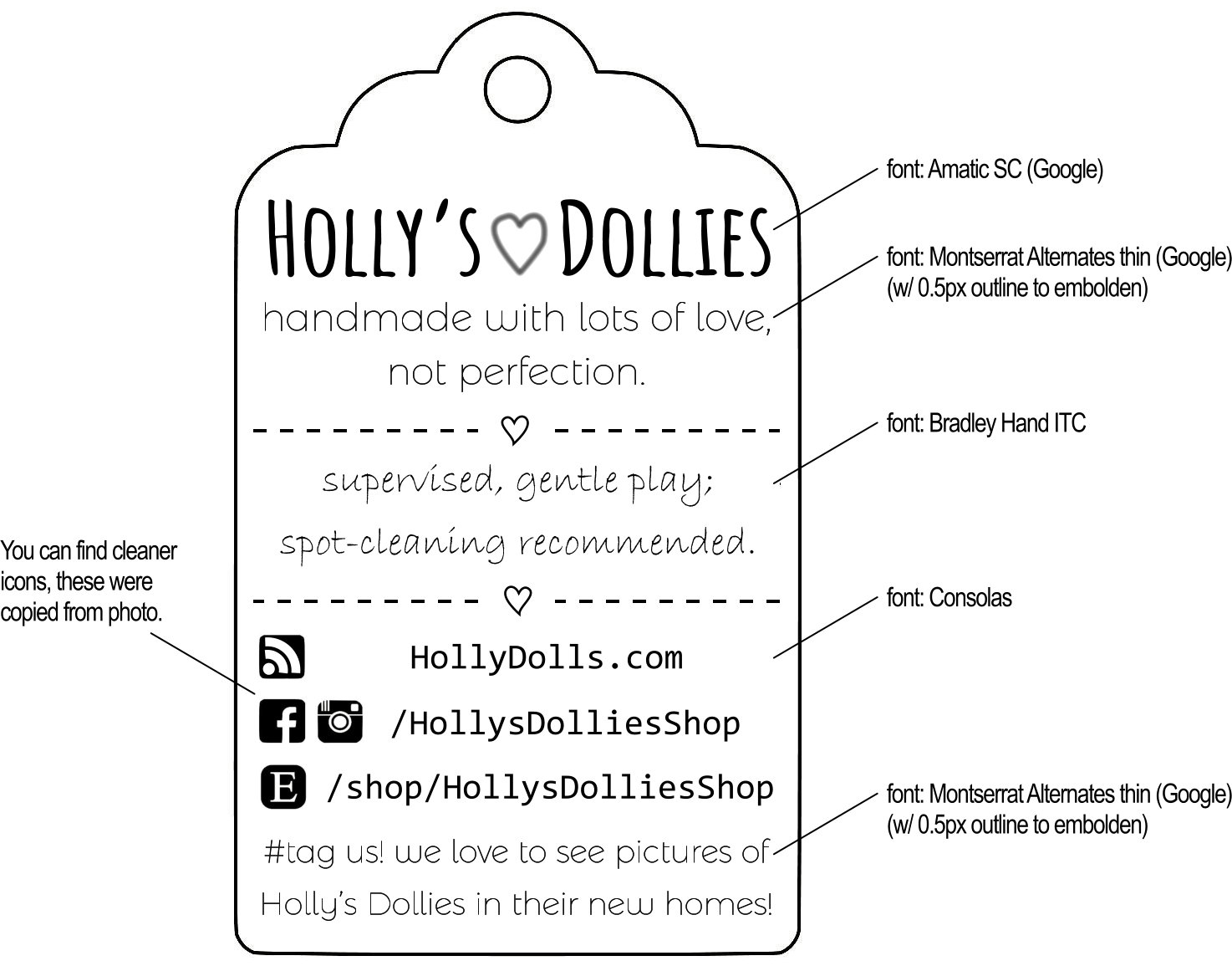
I made this “style guide” for the tag maker last order, when the proofs weren’t what Holly wanted. Now that I look at it again, I’d be annoyed. Especially since the fonts I specified as adding 0.5px borders to “embolden” the words actually have thicker weight versions, and wouldn’t require a process of adding a border that the tag maker may not even be able to do with their software.
When I asked Holly how she wanted the tag-to-card conversion to look, she asked if we could get rid of all the URLs. I told her the same story, about trying to find businesses on Facebook with no URL. I think this is a good way to do it as minimalistic as possible:
- The first link is the “main link,” to her owned-domain website
- which is a short-and-sweet url address (HollyDolls.com).
- It’s spelled out in camel case, to emphasize readability,
- and includes no unnecessary “https://www.” addressing noise.
- Most importantly, if one goes to this site, links to the other urls (Etsy, Facebook, etc.) are prominently displayed. If you want to cut down on listing URLs, this is a way to list only one, and use it as a gateway to all others.
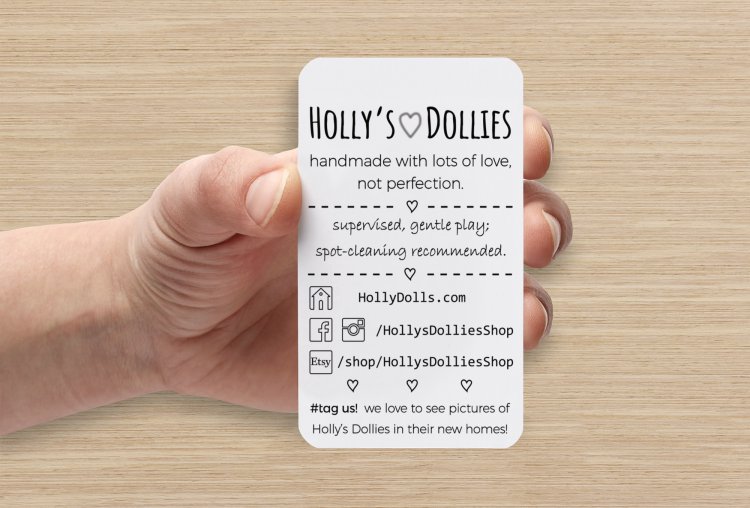
- The other links are spelled out using as few characters as possible because icons are used in place of the domain names. e.g.; an “Instagram” pictogram is used in place of spelling out “instagram.com”. Users who like the Instagram platform will usually understand what it means.
- This also allows space saving when 2 or more icons can be used in a row, meaning the rest of the URL was obtained from each platform as the same (requiring a little forethought and availability ahead of time). e.g.; facebook.com/ and instagram.com/ can both be completed with HollysDolliesShop.
- This was one of the shortest URL descriptors of Holly’s business we could find wide availability for on various platforms at the time. But doing the social media and other web presence addressing this we has obvious advantages of consistency and memorability.
Posting URLs may add Clutter, but it’s Good SEO
Good for Search Engine Optimization: post your social media URLs in as many places as possible because Google spiders may find and note the different websites pointing to your social network and website pages and decides if all these reputable sites are pointing to this business’ web properties, it may be a reputable firm, and perhaps they should be ranked higher in search results so more people looking for their services can find them!
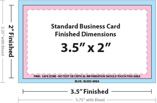
Another Business Card Design Tip: Add in the Bleed and Safe Zone Areas
Notice the above image of the biz card with a caption ending in “_BLEED SHOWN”. It’s got a lighter charcoal outline area that represents the “Bleed,” or the area where some ink may be printed, but it’s also going to be sliced through by the cutting machine. Then, notice there’s also a lighter charcoal line that represents where the “Safe Zone” for printing images and text ends, so keep all important info within those confines (about 1/8th” around perimeter).

Biz Card Mockups
One change: I found or made icons on back of the card, and that was fun.
Also, notice a lot of alternating coloring of words, with white/blue or white/green patterns–that’s supposed to make it easier for a person to parse the info on the card.
Conclusion
This was a fun project of iterating graphic design, one of my favorite work processes.