
A little trick to make Drupal 8.x Views Grid layout columns become responsive using Bootstrap. This allows for collapse to fewer columns per row on narrower viewports.
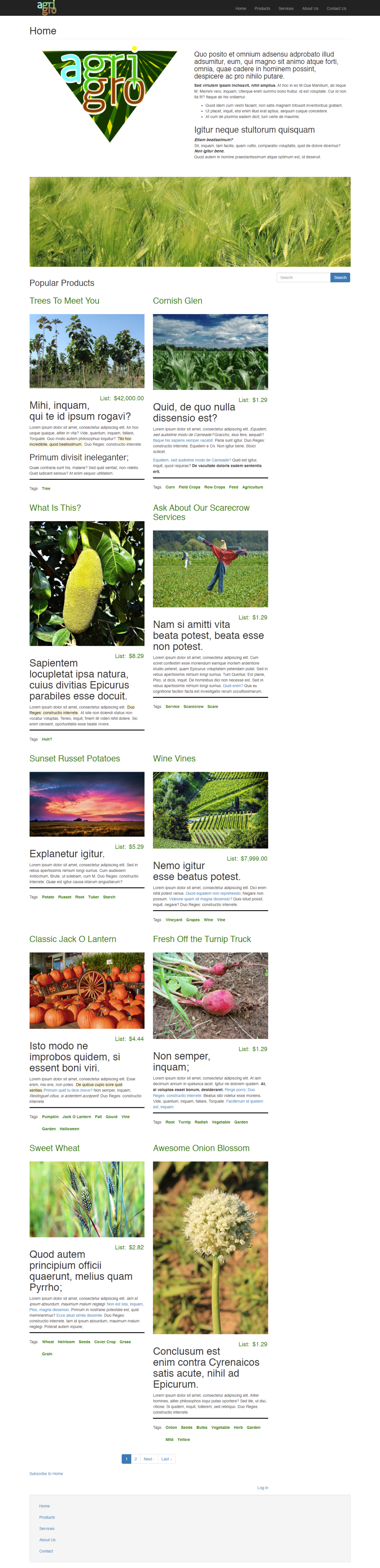
Working Prototype: Drupal 8.x Install with Bootstrap Child Theme
Here’s the desktop Home Page of a working prototype I made (of a pretend crop seed company) using a Drupal 8.x install.
Theme and Style
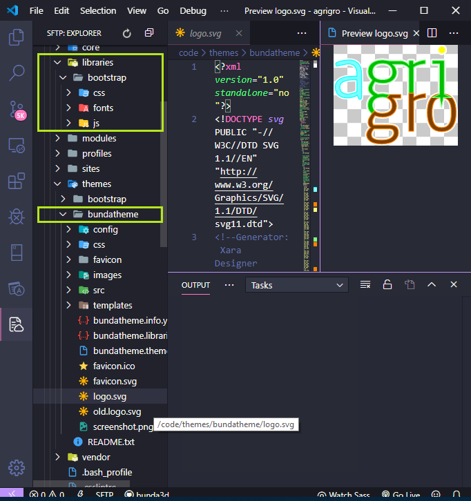
I installed the Bootstrap theme and created a child theme named “BundaTheme” for customizations I do not want overwritten in future updates. Currently this theme still uses Bootstrap 3. I uploaded the Bootstrap 3.4.1 libraries (including jQuery, etc.) to a “libraries” directory and pointed my child theme to use those local files instead of relying on CDN code (the typical Bootstrap style customization source of the theme).
On the homepage I used Drupal Views and Custom Blocks to create an array of “Teaser” configurations of product listings. These are simply the “Article” Content Type that comes in a default Drupal install. I was using them as a Content Type before making a proper “Product Cards” Custom Content Type (with add-to-cart functionality).
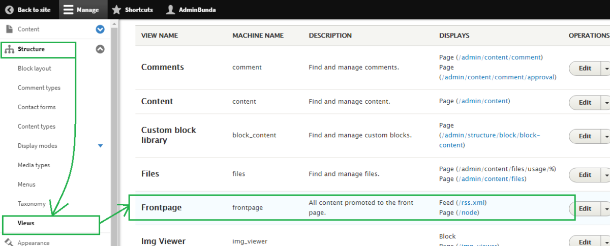
Drupal Admin Choices
I modified the “Frontpage” View at first, with the plan being to duplicate this view for a “Products Page” version later. It will pull in the Product Cards Custom Content Type instead of Articles.
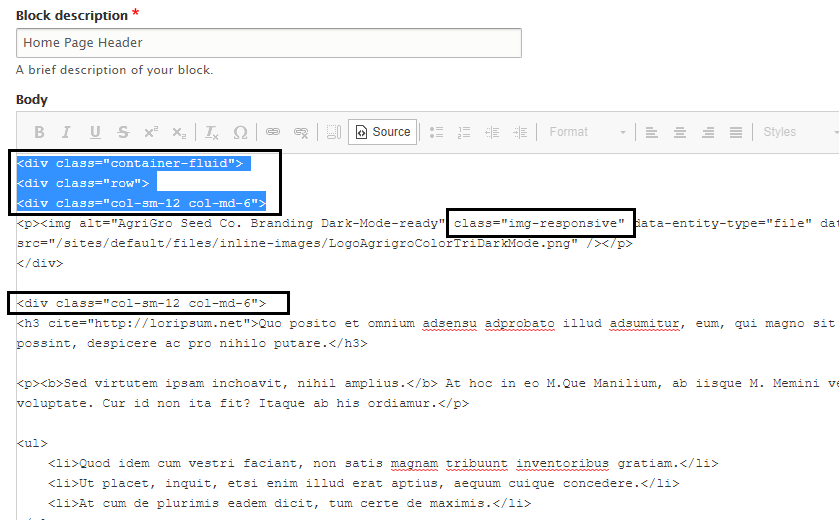
Notice the Grid format, set to display “Teaser” views of Content.
Click on “settings” under Format > Grid
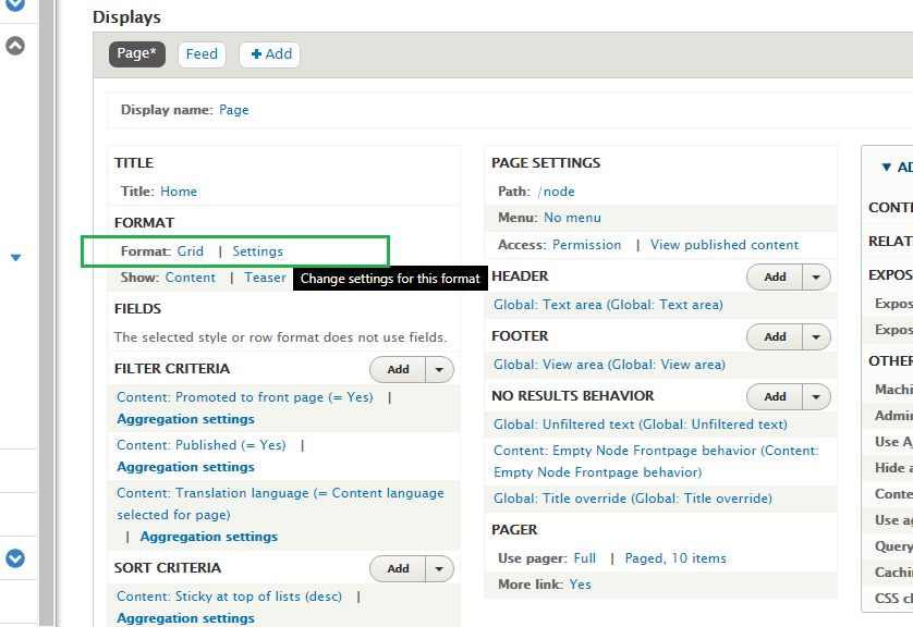
You must enter a number of columns. I entered “2”.
Then, as long as you have Bootstrap installed, you should be able to enter column classes and a row class. I entered the column classes col-sm-12 and col-md-6. That means: for small screens, a column should take up all 12 Bootstrap grid columns. For medium (or “md”) sized viewports, a column should take up 6 of the 12 Bootstrap grid columns, or half, meaning 2 columns will fit in Medium-sized viewports and up.
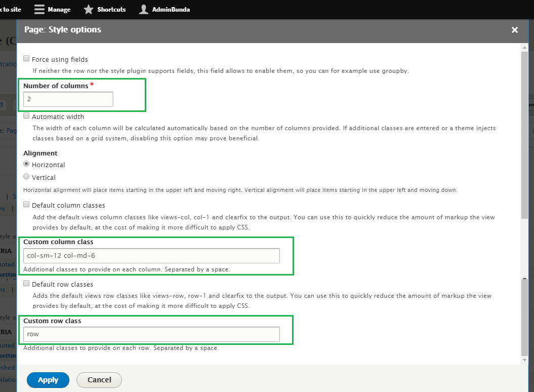
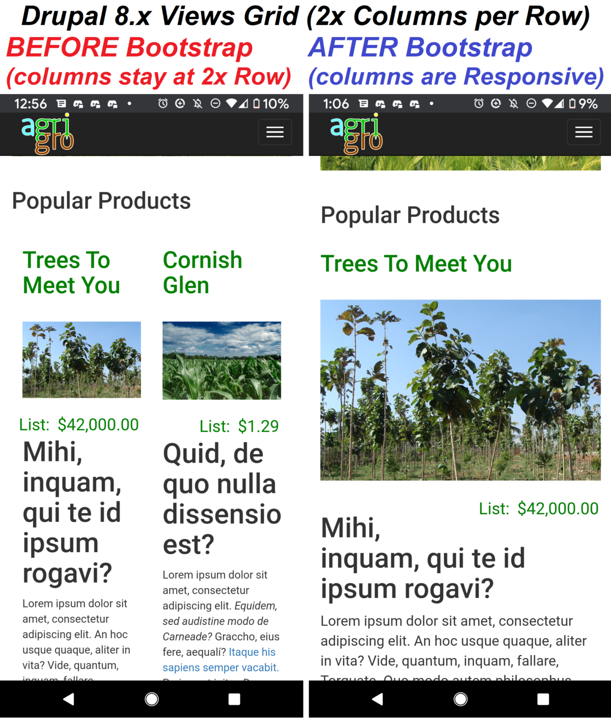
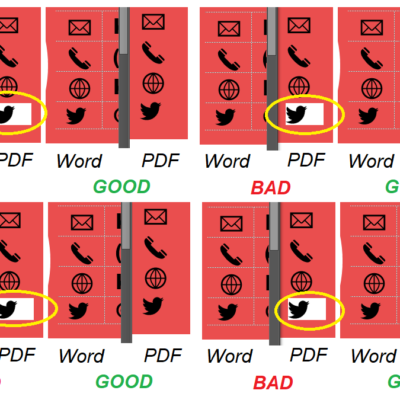
This solves the problem of the Drupal Grid sticking to the “2” columns setting, no matter how narrow the viewport gets, which does not look good on a phone.
Notice on the left view below, the columns are so narrow it wraps one of the title words (“dissensioest”).
You can enter other Bootstrap classes. Since this is BS3, it still has “panel” components (I think a lot of components are deprecated in BS4 in favor of using the Cards classes for everything). I didn’t like the way panels looked wrapping each content item, but they did work, so if you like to wrap with Wells or Media or some other BS3 components, try it out.
BS Classes in Custom Block Header
In the case of the top section of the home page, it is a Custom Block I created and then added to the Structure > Block Layout admin area. Notice I make it show up only on the home page (or as Drupal knows it: <front>)
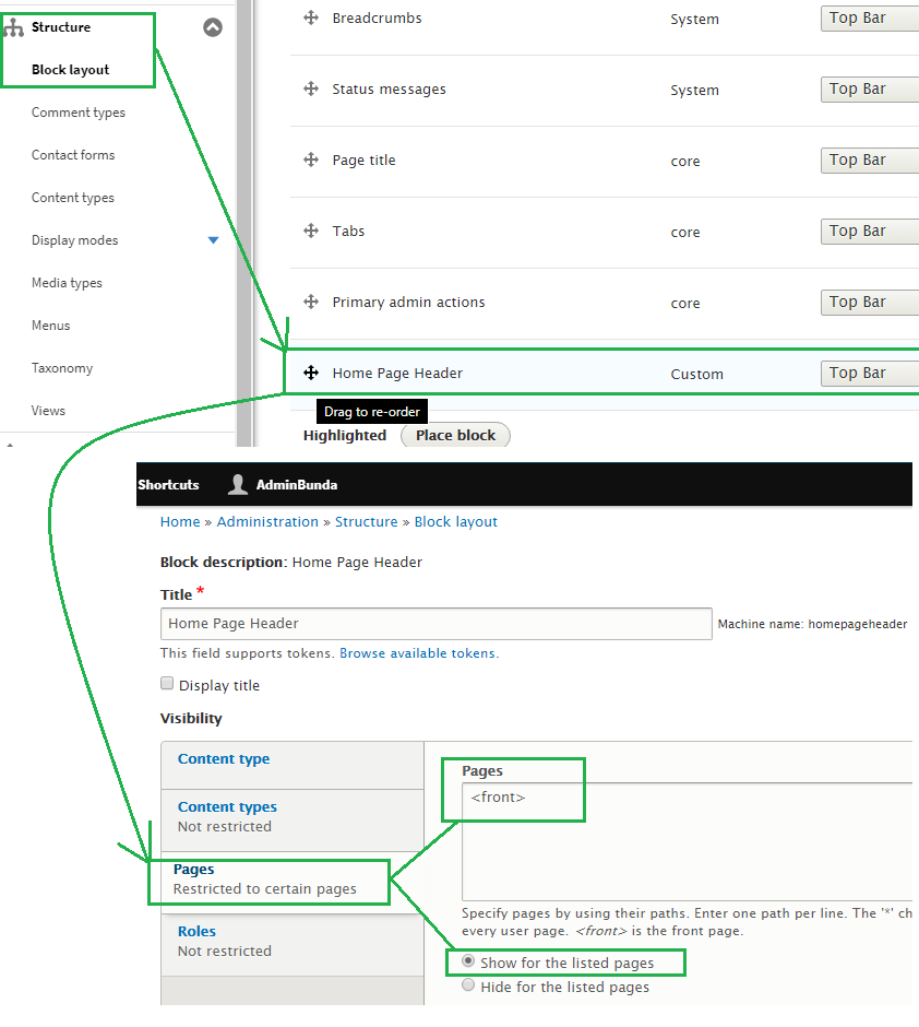
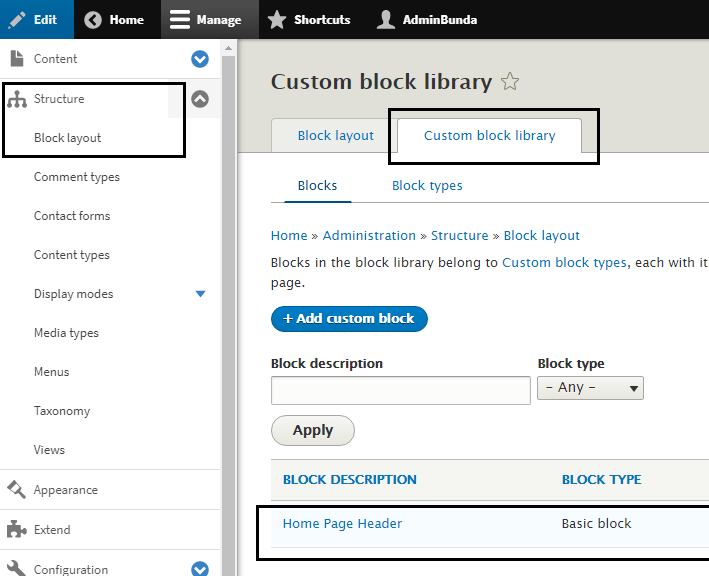
Edit the content of a custom block by going to the Custom Block Library tab.
Adding BS classes is done the standard way of writing semantic HTML and including BS classes in the elements.
Careful to use the BS major version you have installed in the in the Drupal installation, as there are some breaking changes I’ve noticed. i.e.; BS3’s “img-responsive” class is changed in BS4 to be “img-fluid“.
Responsive Results
Here is an example of how the page started to look after employing Bootstrap classes that allowed for more graceful responsiveness on mobile viewports.


Leave a Reply