
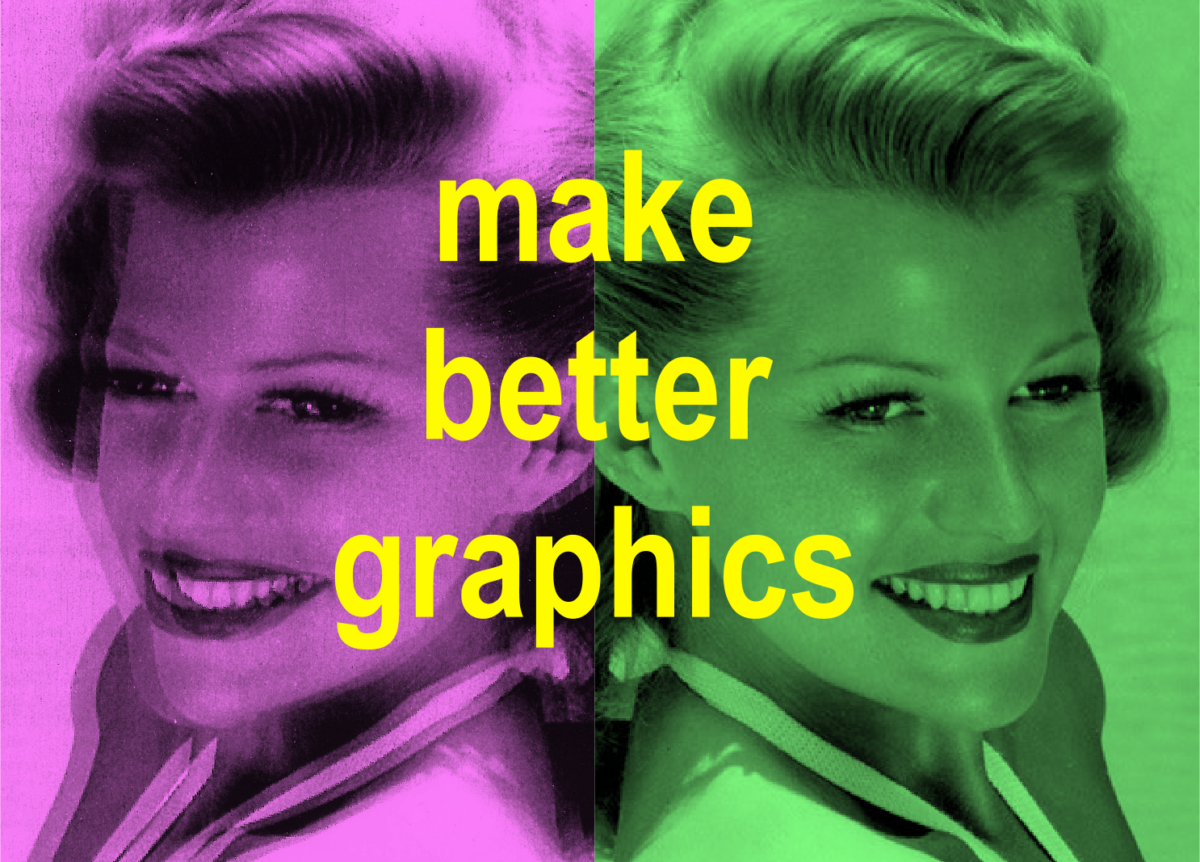
Tips Listed at End (Long Explanations & Tangents at Start)
With the advances in web styling (a response to myriad newly-invented viewing-device sizes) images are getting stretched and squeezed more than ever. Recently, I reworked a website from only 5 years ago, but I felt like I was cryogenically frozen for decades instead. Like I had suddenly awoke to find the website–which had been a functional collection of HTML and CSS files viewed on a rectangular display–was now considered “unresponsive.” It doesn’t respond to viewport size (desktop


A lot has changed in hardware and internet design standards in that time! There’s Apple Retina

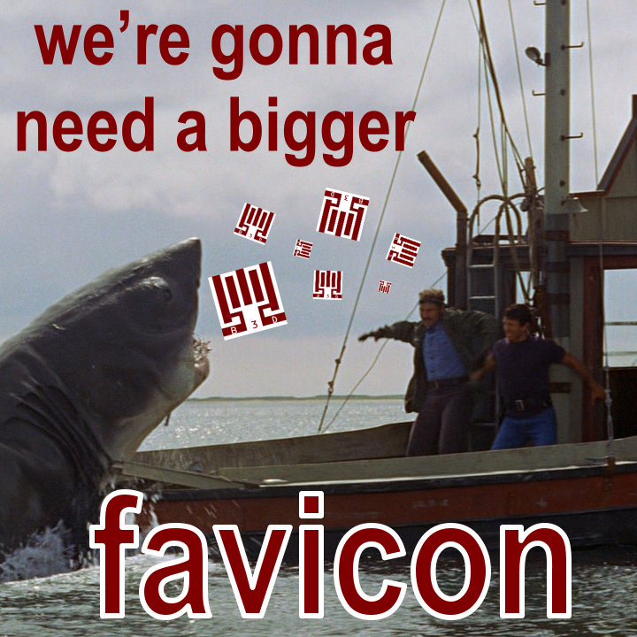
It used to be the one square icon you needed to produce for a site was a 16 x 16 pixel favicon. Nowaday you need to have 512px, 128px, 64px, 32px, and the 16px images. I’m not even sure what they’re all for anymore. Windows tiles, Retina displays


And because of all the different viewport sizes that have arisen since the 2007 advent of the iPhone

Bigger Is Better (Size Matters …in Branding Imagery)

It’s been my experience that when you start making an image much smaller or larger, it looks bad. Computers and smartphones have GPUs to try to make jagged diagonal lines look smoother (anti alias), but they can only do so much. So when I’m making or remaking a graphic that I know may be reused and resized, I try to make the original size large. At least 1920 pixels. Seems to me that things look better when you shrink large images smaller, versus blowing up a small image 200+%.

horrible copying of horrible copies
Another reason to make a graphic very large is to help the end users. If you make a logo


After a few times of pasting the original image into derivative works, it’s probably going to get lost in the darkest corners of a single employee’s PC filing system.
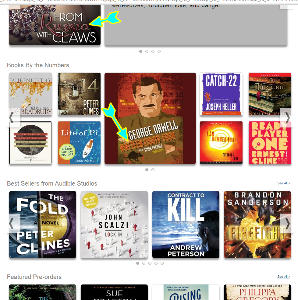
And another person will try to reuse the image later by copy/pasting it from an old signature from the bowels of their saved emails (where the image was scrunched to 150 pixels wide and didn’t preserve the aspect ratio). They’ll copy that version of the image and then resize it again, which will look even worse. This horrible copying of horrible copies will continue, sadly. So it’s best to give end users a large version up front, as it may take a little longer for it to look terrible.
V for Vector-y
Of course, this could be avoided if a vector format was used, like SVG or DWG, which looks the same no matter how large or small the image is resized. But a lot of people don’t use software that handles these formats well.
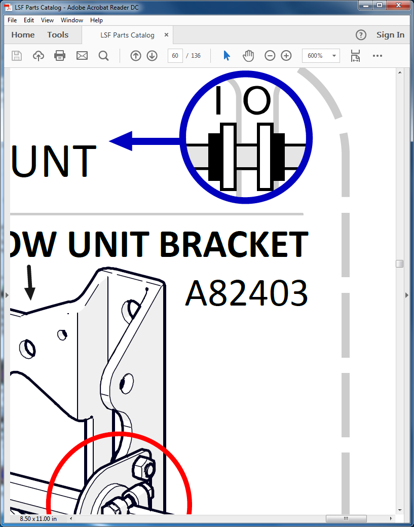
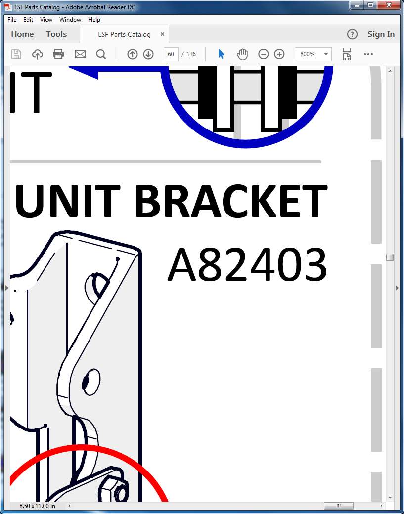
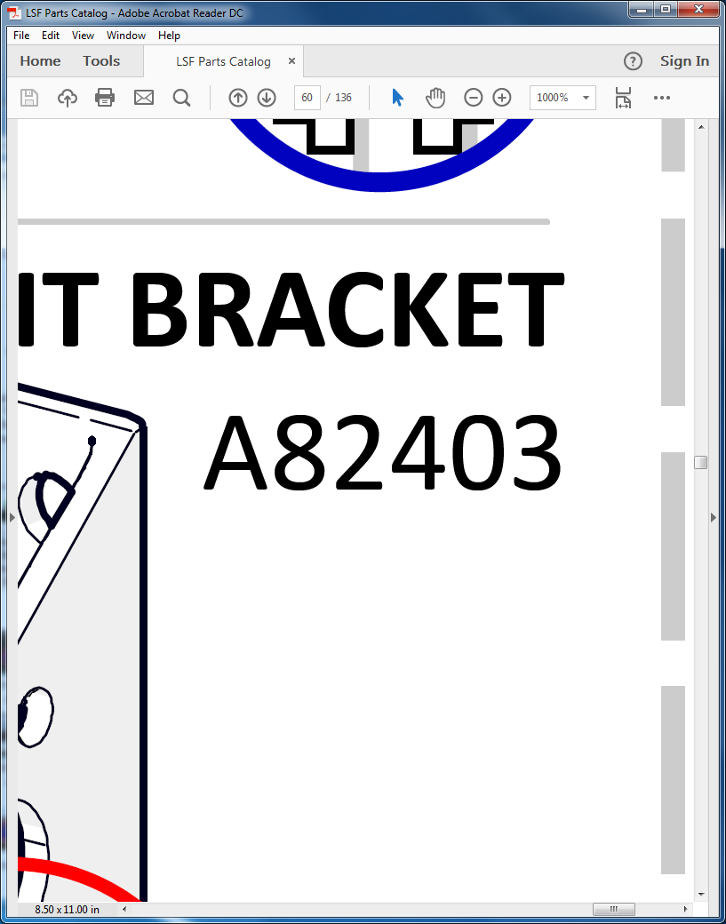
Ironically, PDF, a visual format used in every office in the world, is a format that behaves like vector images in that it looks the same whether you zoom way in or out. (Except for the non-vector elements of the document, like any JPGs, PNGs, GIFs, TIFs, or if the PDF is just a scan of a paper document…) Vectorized text looks crisp and uniform at 100% or 1,000% or 10% zoom size. Same with a vectorized logo that’s embedded in a document that can be correctly exported from the editing software as a PDF.
Vector Files: Web-Safe at Any Size
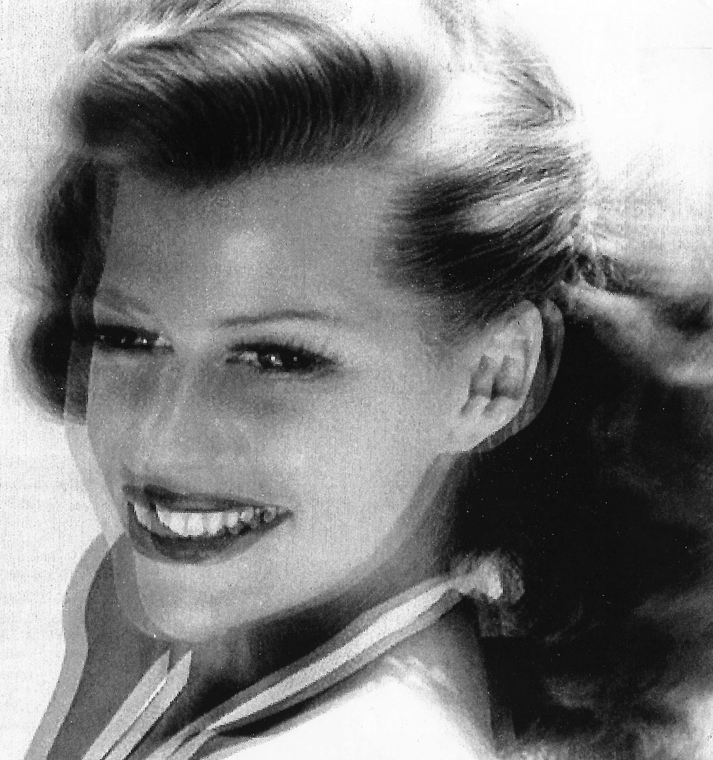
Notice how even when zoomed in from 75% to 1,000%, there is no pixelization. The edges stay crisp and stark and proportionate. This is because I created all the text, lines, and line art as vectorized assets and exported them in a vector format (PDF).
But since your average office worker who’s just trying to throw a logo on a bulletin doesn’t use pricey Adobe Creative Suite


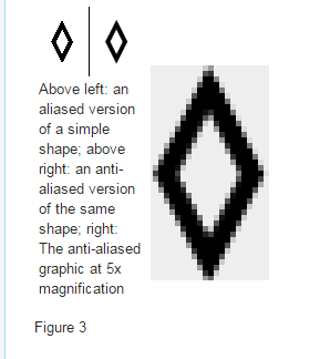
What is Anti Aliasing?
If you’re not familiar with anti aliasing of digital images/video here’s a nice little video from Linus. The only thing I would’ve liked him to say differently is when he explains how a GPU “fills in the missing information” on a diagonal line–I would instead describe it as: Changing the color of a pixel to the average color of all the pixels around it. That’s what makes the gradual gray pixels along the jagged edge of a diagonal black line on a white background, and thus creates a smoothing effect.

More on anti aliasing on wikipedia, where I got this cropped screenshot:
Making Images That Resize Well is a Sign of Professionalism and Craft
I wrote this post because I’ve long paid much attention to detail when it comes to how digital graphics render. If I see a lot of “jaggies” in say, a corporate logo on a web page, I think it’s a sign of someone who’s in charge of marketing and branding being unprofessional or clueless. I’ve probably made this same mistake enough times to be grossly hypocritical, but ya gotta have [double] standards!
Here’s an example that comes to mind from GoDaddy. For years now, they’ve had this small logo with a 1pixel-thin oval around it in white on black background (AN OVAL!!! WHY NOT A DIAMOND IF WE ARE BEING SO BOLD???). It jaggs ridiculously, and the irony is that GoDaddy is a huge company whose bread is buttered by web pages getting designed and hosted, so you’d think they’d have some people with strong opinions about graphic design standards

A-B-Cs. Always Be Comic sans.
That oval logo scheme has since been replaced on MOST PAGES (except the cPanel UI, I’ve noticed). They changed it to a nicely done small logo with (a)thicker (b)dark lines on a (c)light gray background, which is, IMO, much easier to pull off than (a)thin (b)light line on (c)black background.
And now, they’ve since updated their scheme again, perhaps losing much of the whimsy cache of their branding with the font change.
I understood when Google went from serif to sans serif. It seemed right. But if you can quantify the millions GoDaddy’s spent on marketing with their comic sans custom font, I’m not sure I’d toss it aside yet for some chunky, forgettable, extra bold meh… And yet they keep the crazy Daddy doodle dude. Is it the logo version of a mullet? Corporate in the front, Crazy Daddy Doodle in the back?
I’d be interested to hear the strategy behind this from the marketing honcho. I’m sure that person gets paid big bucks to decide these things, and probably has some compelling pitch of why to drop the comic font. Then again, this is the same team that did the oval logo for years…
One more thing to add, upon rereading this: This is NOT much ado about nothing. Details matter. Seeing a company with weird artifacts

Brand Designers Ogle Google.
These brand designers are married to Google’s image, and so they’re committed to nagging it into fundamental personality changes.

Next Page: 4 Things To Do to Make Graphic Images Look Good at Larger and Smaller Resizings
4 Things To Do to Make Graphic Images Look Good at Larger and Smaller Resizings
Things I’ve figured out the hard way about making raster images that look decent at largely different sizes.
- 1.) Make your images LARGE. The whole 1st part of this post was about this, so I won’t reiterate. One other thing to say is: For page loading speed, Google PageSpeed Insights will constantly harp on you to serve images sized perfectly for the viewport so as not to waste a single bit of information transfer. But I argue that shouldn’t be your responsibility. Let a CMS take your large image and create several smaller versions of it to serve, and further, a plugin can “lazy load” and resize it more from there.
- 2.) Make your outlines and/or borders thick enough to be smoothed (averaged) by anti aliasing GPUs, and your graphics program


1.) Border thickness. With an already-thin font, the artist may have considered not having an outline border at all…
2.) Border color. If you’re going to 2-tone your text, make sure the color ADDS to legibility. After all, you’re trying to get a message across. (more on line color on the next Tip).
3.) Font selection. Already mentioned that the font is thin. With narrow-style fonts, they already can be difficult to read. Don’t confuse their lines anymore than necessary, or you risk your message turning into mere noise and ignored.
4.) Tilted (angled) lines. This is like the anti-aliased diamond mentioned above. Angled or curved lines are already prone to stair-stepping. Diagonal lines are unavoidable, but realize where they make you vulnerable to pixelating your message, and design accordingly.

- 3.) Play with the colors. Make sure your lettering and background outline colors are playing nice with each other. Every graphic will probably have some high-contrast lines on it, there aren’t many light-gray-on-white logos. Line art by its nature is often black lines on white, you don’t contrast more than that. Depending on how much freedom you have with the color scheme, play around with what looks better – dark on light or light on dark? Blue with yellow outline or blue with gray outline? It may just be a psychological trick, but perhaps that GoDaddy oval logo would’ve looked less jagged if it were dark strokes on light background?
As sort of a “sub-tip,” let’s talk about testing workflow.
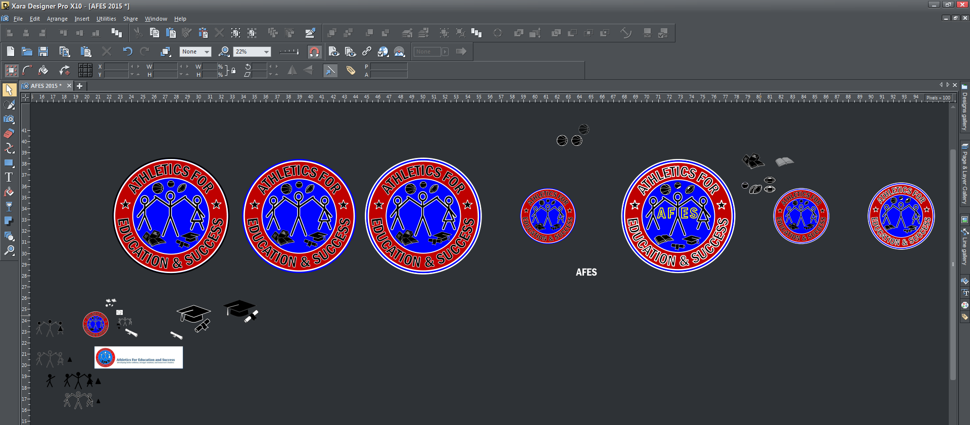
Here’s some screenshots of how I might start testing graphics.
- The first image: My graphics editing software may start looking a little obsessive when I’m testing different elements, border sizes and colors on a graphic. It’s a “sandbox,” use it as a place to make a lot of copies so you can choose the best iteration. Find what works.
- The other images show how I may start testing assets “in the real world” (read: a temporary website I set up on a subdomain). Let’s see how they look in different places, on social media; web pages on desktop, tablet, phone viewports; email templates; Print some out to see how they do on forms and documents (a grayscale version may have to be made); etc.
- 4.) Transparent background? Consider adding a halo around the edge of your graphic. It sometimes makes sense to add a light-colored background or outline to the overall image. I call this a “doily


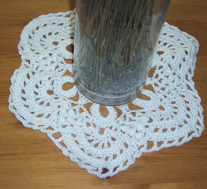
If you’re trying to get those little white edge pixels that are so-small-yet-so-distractingly-noticeable, sometimes it’s easier to just add a deliberate thick white or light-colored border line that blends them out. The “If ya can’t beat ’em, join ’em” strategy.
Here’s a rendering I made, and it has a light-reflection halo around the edges that’s hardly noticeable until you either have a really dark background behind it, or it’s scaled down or enlarged. But those things tend to happen on the internet or with digital copy. So here’s how I blend it out:


If No Doilies Allowed:
Otherwise, if not appropriate to use white borders as a trick for handsomely setting transparent-background overlays, I have to try to:
- Select all the similar-colored (unwanted) pixels in Photoshop
- Or select them and then delete them, but that often backfires;
- And/or, use smudging or blending tools around the edges, but it’s time consuming and can easily start looking as garish as lighting artifact pixels.


Sorry guys, not every PNG can set on a doily.
What’d I miss?
There’re a lot of opinions and subjective tastes in the perception of graphic artwork. I listed 4 suggestions for making better graphics that will withstand some of the twisting and pulling that happens to images when they leave your editing program and are flung out into the world. If you have other tips or opinions, comment or email.