Blast From the Past
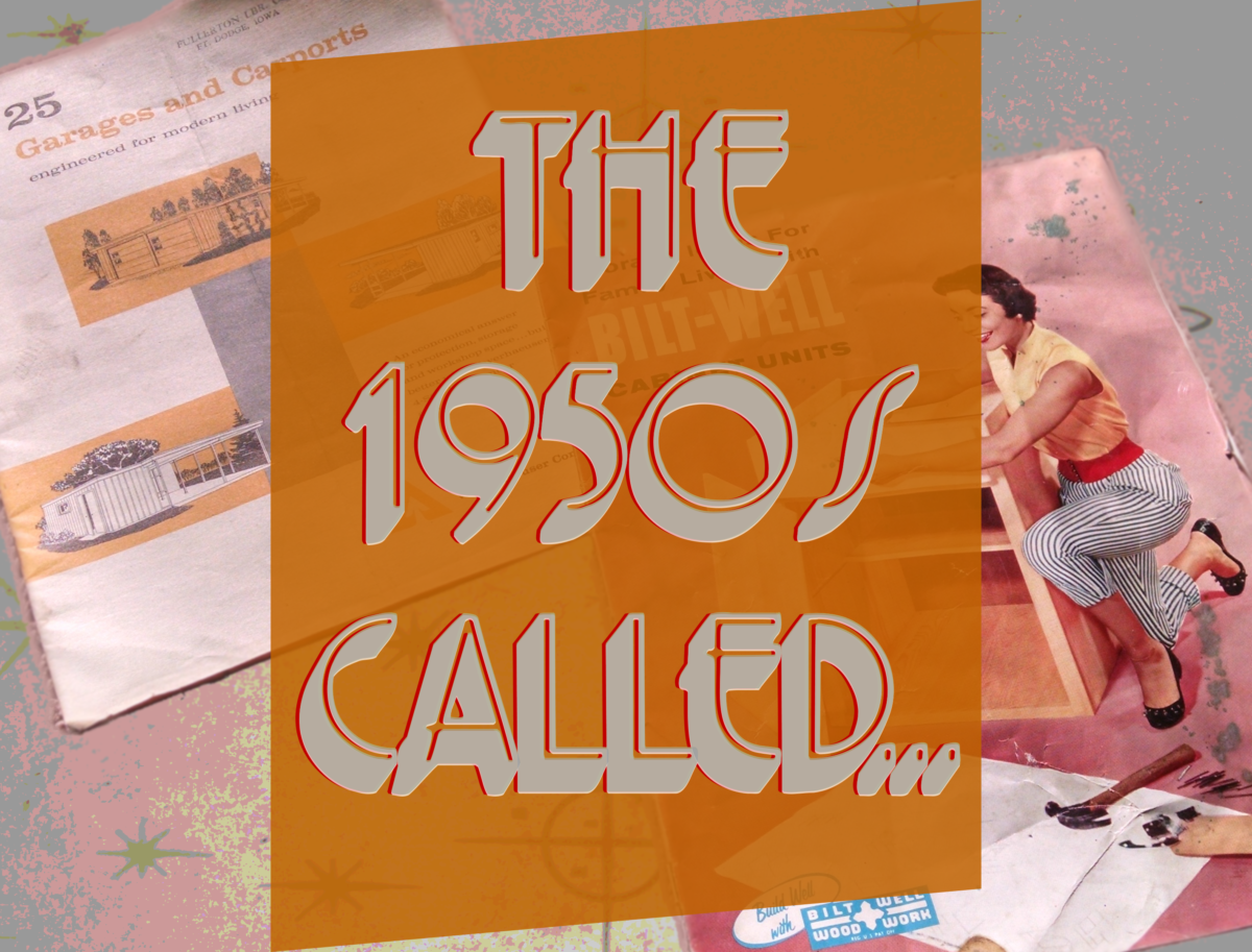
I found these 2 brochures from the 50s or 60s (not sure of dates, but you can tell their period from the heavy use of sans-serif fonts, and mid-century kitchen and home designs).
Say! Shouldn’t You Park Your Edsel in a Nice, New CARPORT?
Enjoy these pages from a Weyerhaeuser garage and carport promotional brochure, which apparently aimed to sell more of its core business lumber products by providing building plans. With visually stimulating renderings of sample structures in light gray and mustard motif, I’m surprised there’s a forest left in North America. 25 Garages and Carports: engineered for modern living.
Next Page: WELCOME! To the Kitchen Of The FUTURE!
WELCOME! To the Kitchen Of The FUTURE!
The other brochure is of Bilt-Well Woodwork’s Storage Ideas For Family Living with Bilt-Well Cabinet Units.
RoseBilt-Well
Similarly-styled cabinets have furnished kitchens in many homes I’ve visited, especially when I was a child.
The farmhouse I grew up in was built in the late 1890s (it’s since bulldozed and burned, literally scorched earth). It had a couple of what I assume were original kitchen cabinets, painted so many times their wonderful small turning-knob latches could hardly catch on a humid day, since the doors barely fit in their paint-tight jambs.
All the rest of our cabinets were an apparent remodel in the 1950s. I’m an A-sentimentalist; nostalgia is a waste of time. But the kitchen images from the brochure take me on a trip down memory lane (simply remembering is different than nostalgia).
Here’s where I go into my Don Draper Carousel Pitch (but about old cabinets)
(It’s okay if you run out of the room crying like Harry)
I remember how certain hardware functioned, how once-fashionable materials looked and felt. The thin-but-solid wood cabinet door with a magnetic catch and large, thin-edged saucer pull opened and closed differently than today’s heavy-framed cupboard door with cam hinges, soft-close felt pads, and rounded brushed-nickel knob pull.
What’s Old is New[ly marketed] Again!
One thing that really surprised me about the Bilt-Well book were all the mechanical accessory upsells offered. I was under the impression the telescoping lower drawers and corner-cupboard half-circle shelves were recent inventions, of the last generation or so. (I love watching This Old House
I guess I took some of today’s home improvement marketing to mean cabinet technology was suddenly achieving advancements à la Television’s leap to 16:9 ratio x 1080p resolution after 50 years of 4:3 x 480. But no, just because your salesman touts how wonderful color television is doesn’t mean it’s new technology.
Aside:
Putting “Mad Men
I just like that show. I’ve loved the style of midcentury modernity since I was young–from graphics to furniture to architecture. And I think now, in many people’s minds who know both the show and love that period’s design, the two things are interlocked. Mad Men has brought the art to life. It occurred to me while looking at the pages, and wondering about the layout techniques designers had to use decades before PCs; the people who made these layouts probably smoked cigarettes in their offices while making this work product. The point is, I was thinking about the people who made it, not just flipping through an old brochure.
These brochures aren’t only of a different time and style, but of a different culture and society. Where I live, grocery stores still had ashtrays at the ends of aisles in the late ’80s. Smoking wasn’t outlawed in bars and on public grounds until nearly 2010. Those cultural conditions, of walking into a store and standing next to a smoking person, seem so strange–and they lasted until relatively recently!
I doubt we’ll find out who made the brochures’ graphics, photos, copy, layouts, direction, proofs—or whatever all went into their production. We won’t probably know if they worked in-house or on Madison Avenue (planet earth or the rings of Saturn). They’re probably mostly dead. But that I’m even wondering about their lives is because Mad Men made aged production art the actual achievement of working humanity, not just attic trash which offers the passing curiosity of period-style exhibition when it occasionally sees daylight. People woke up, dressed, and arrived at work to make decisions, art, and these documents.
