


Work-In-Progress
I’ll be back to flesh out this UI/UX portfolio page in the future as time allows. — Stay Tuned, Kris
Why the drawings and CAD renderings? How is that UI/UX?
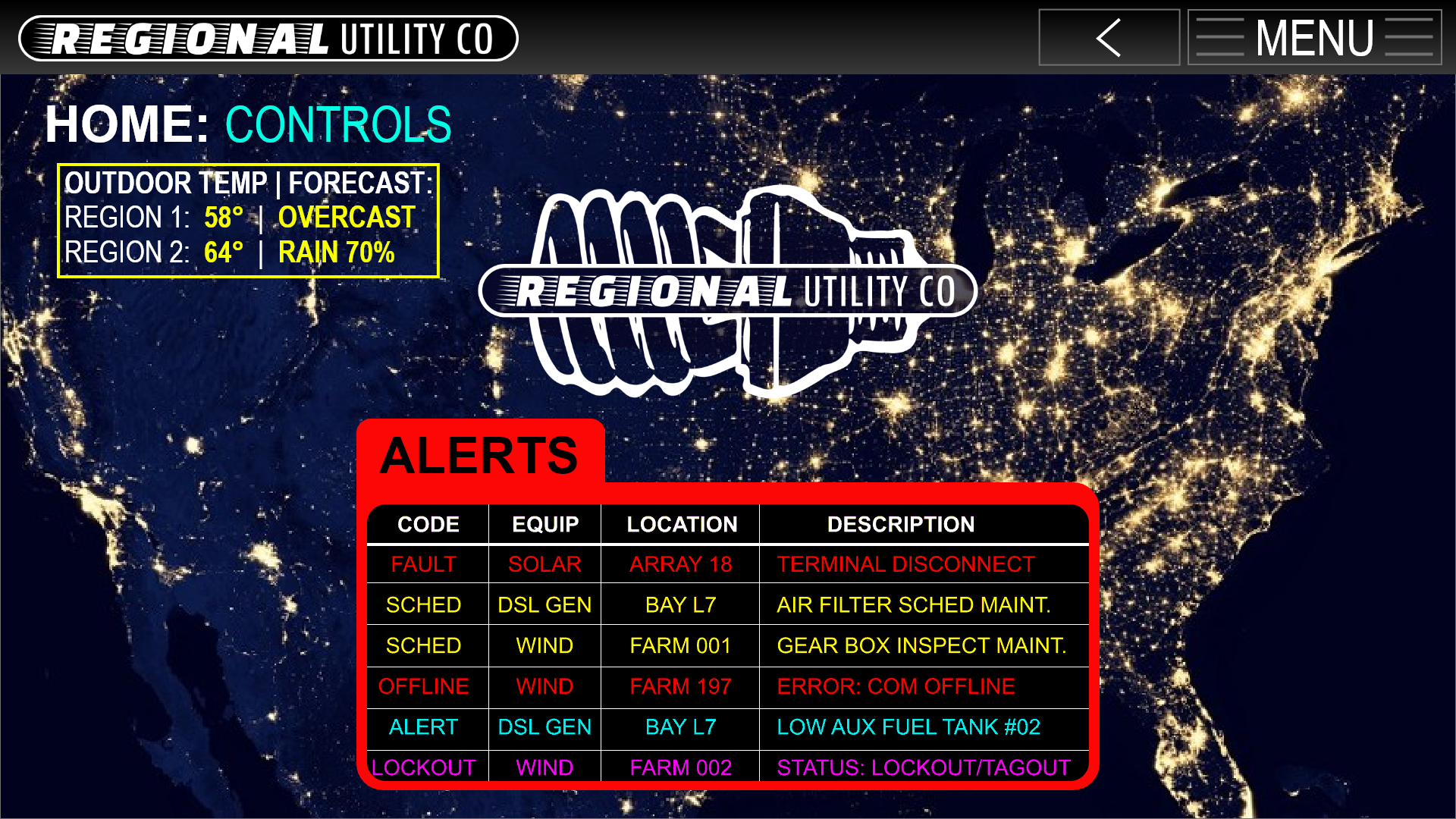
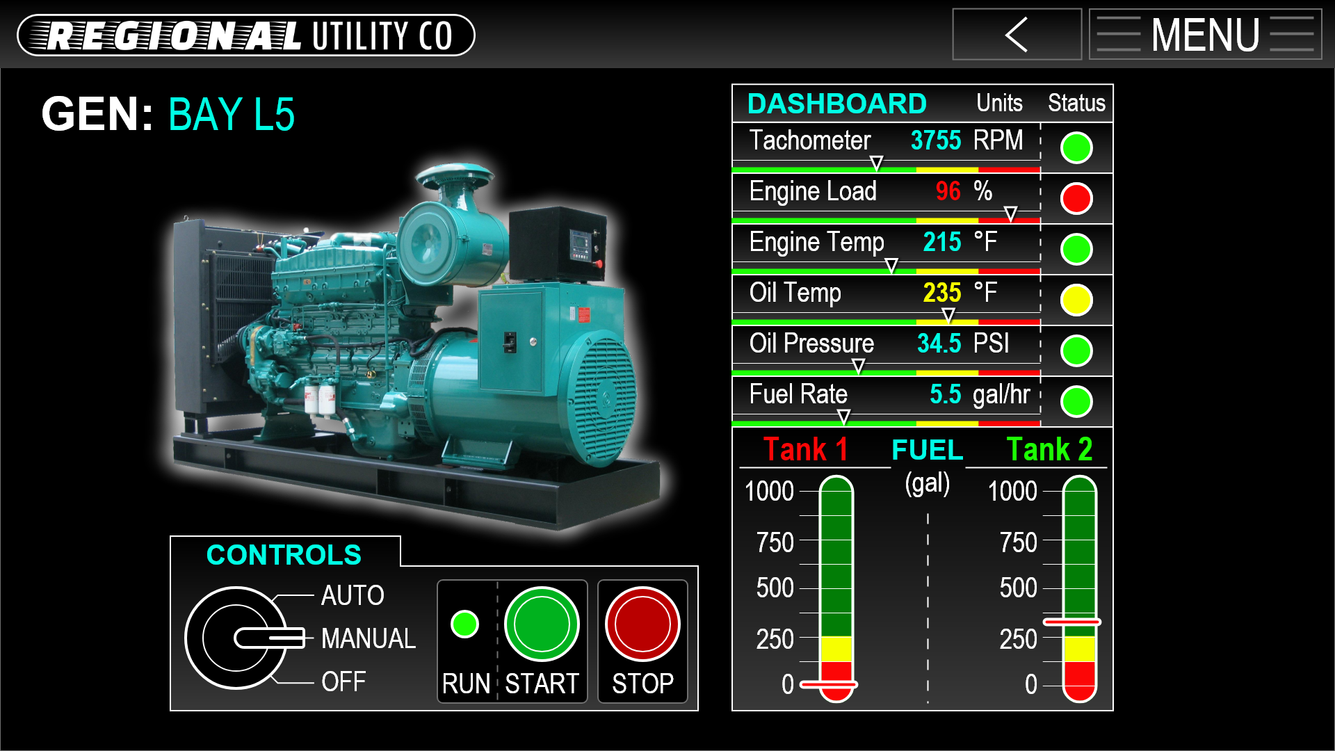
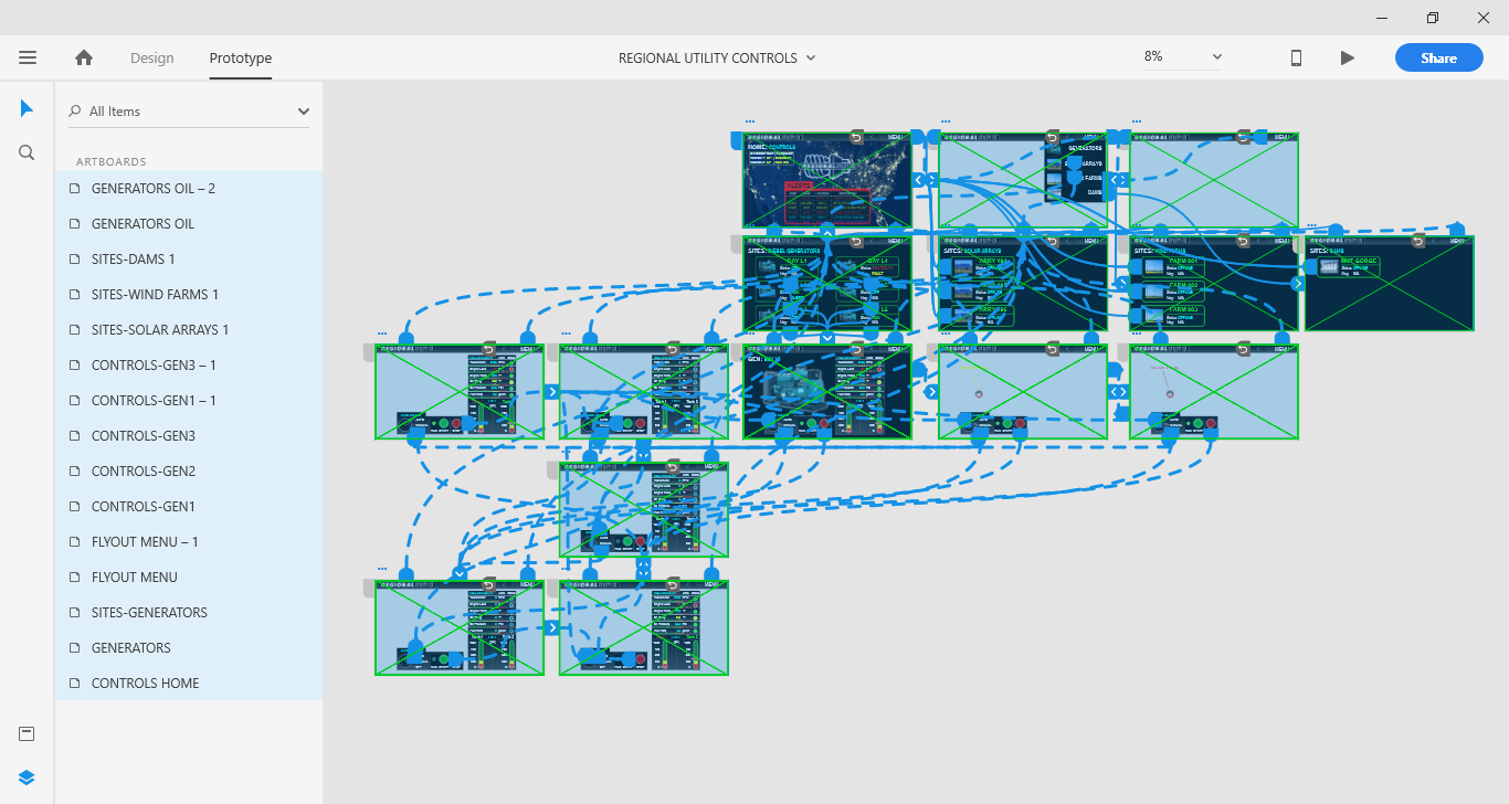
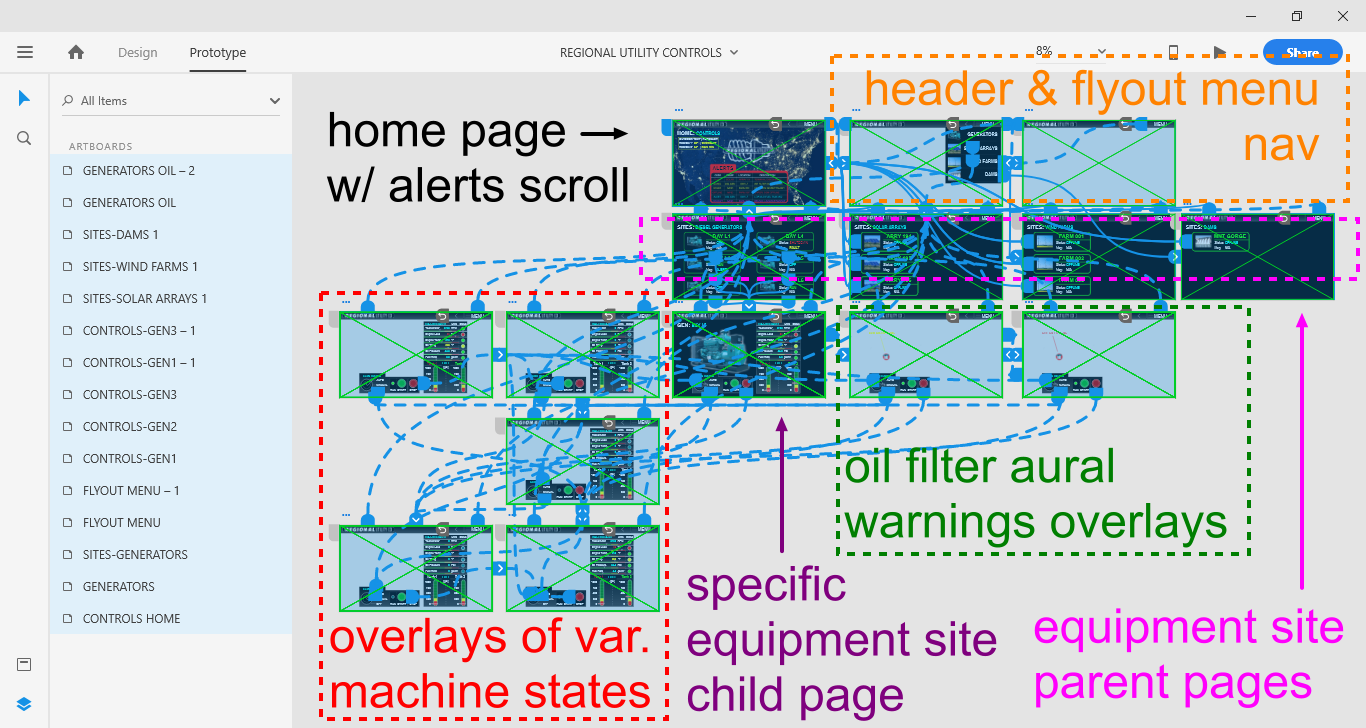
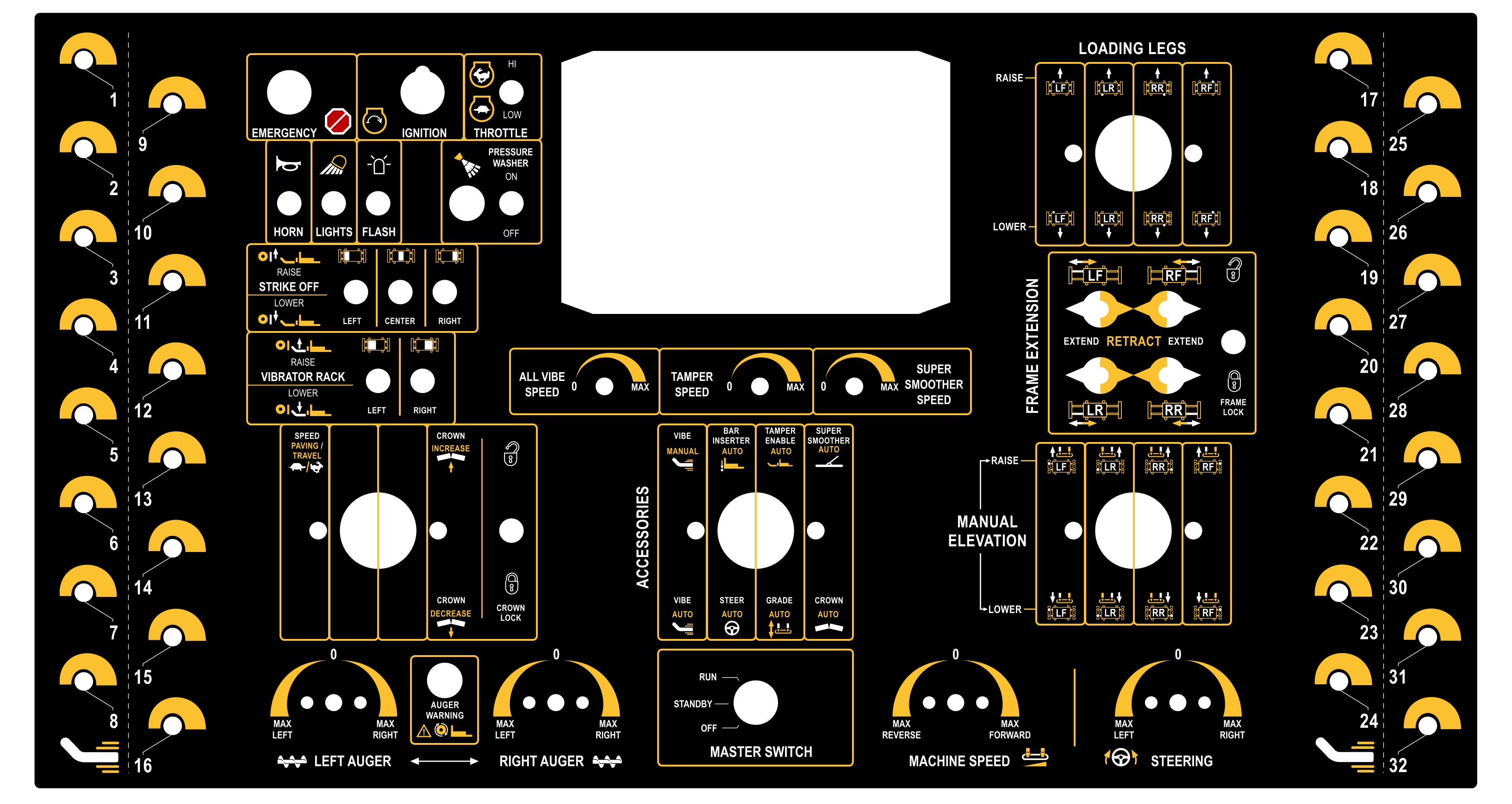
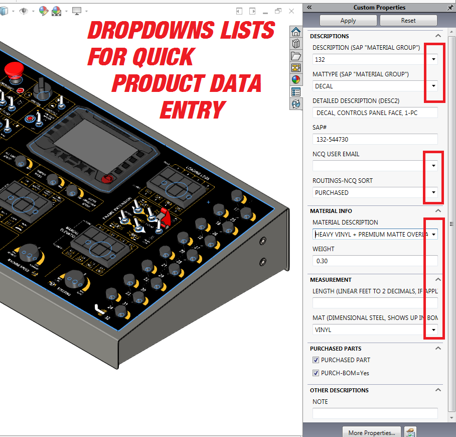
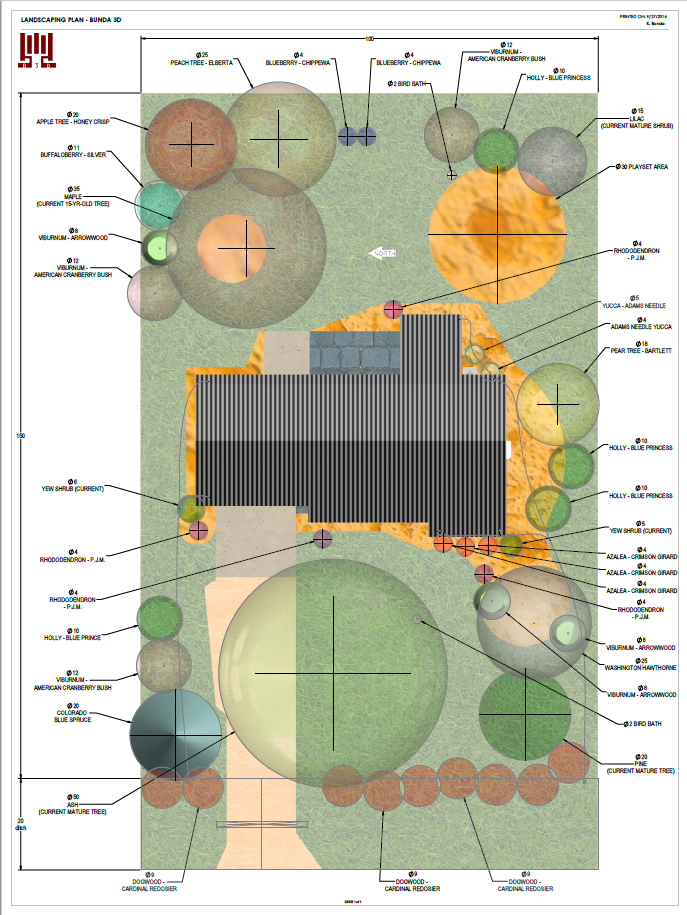
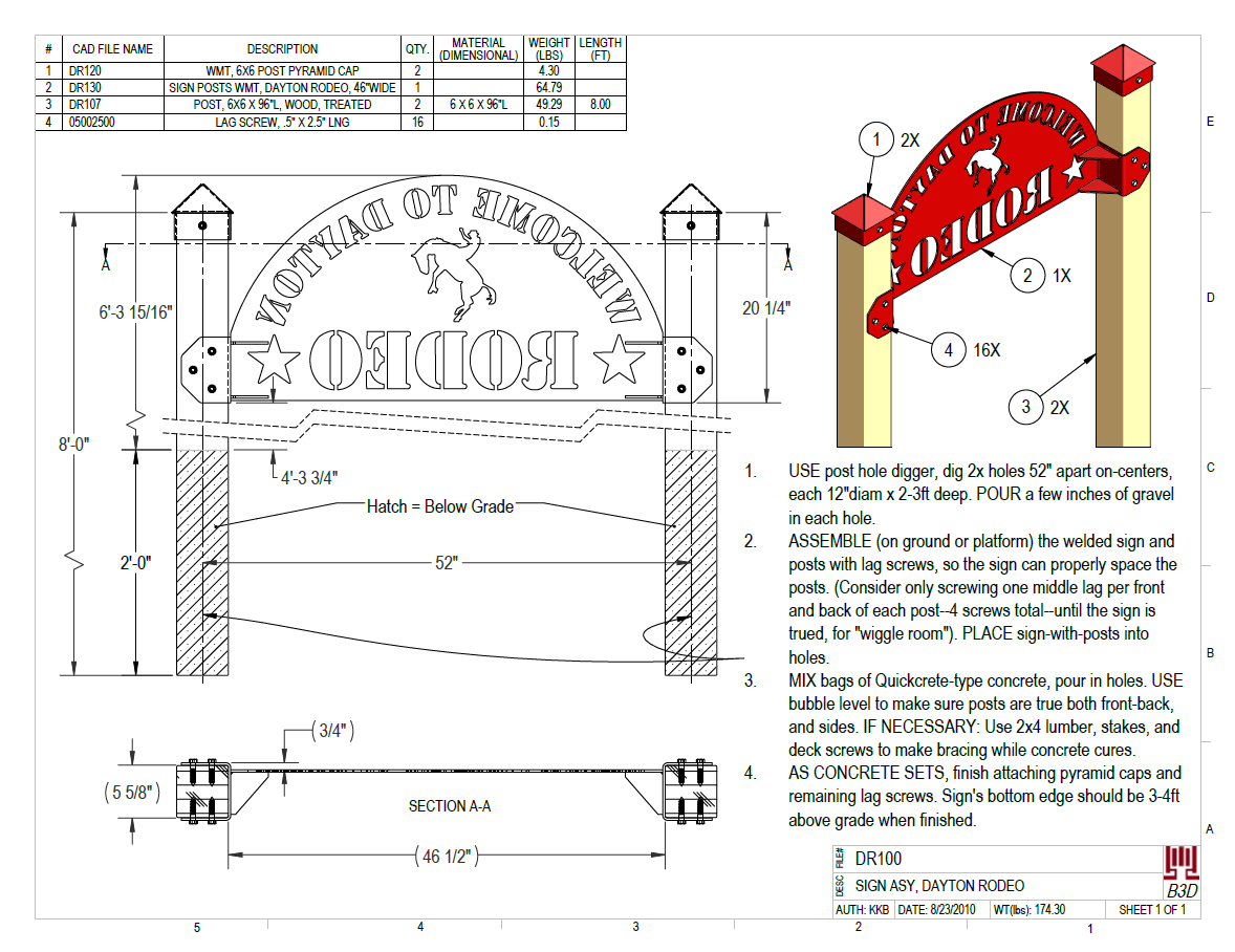
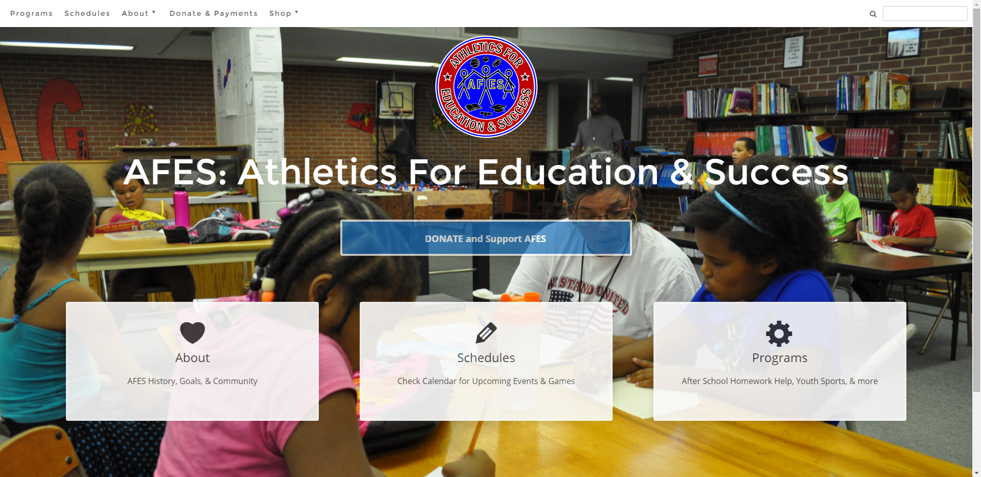
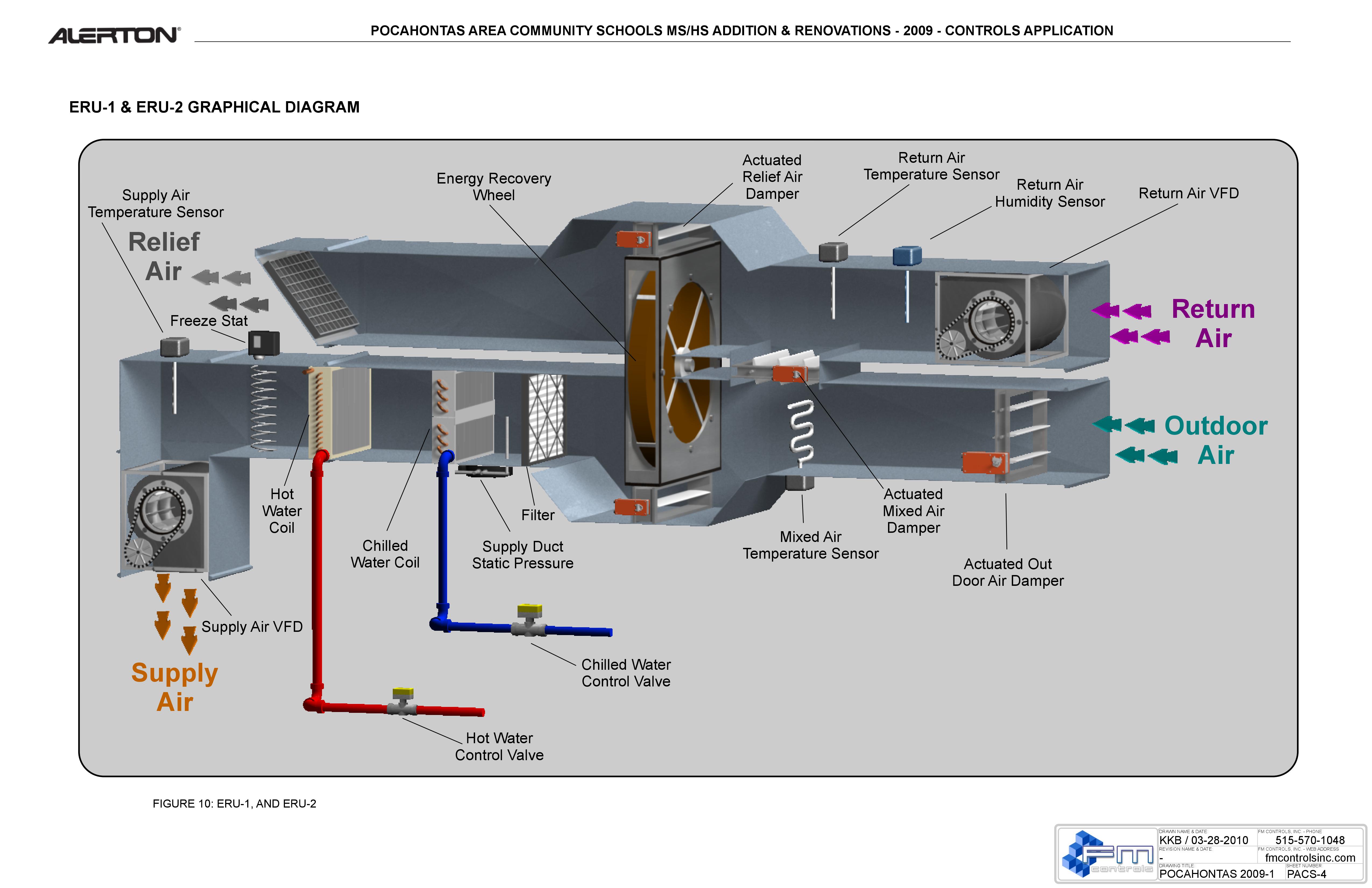
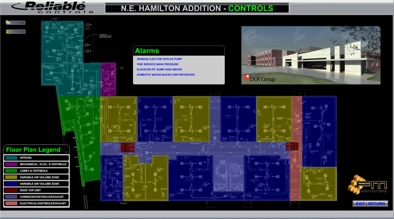
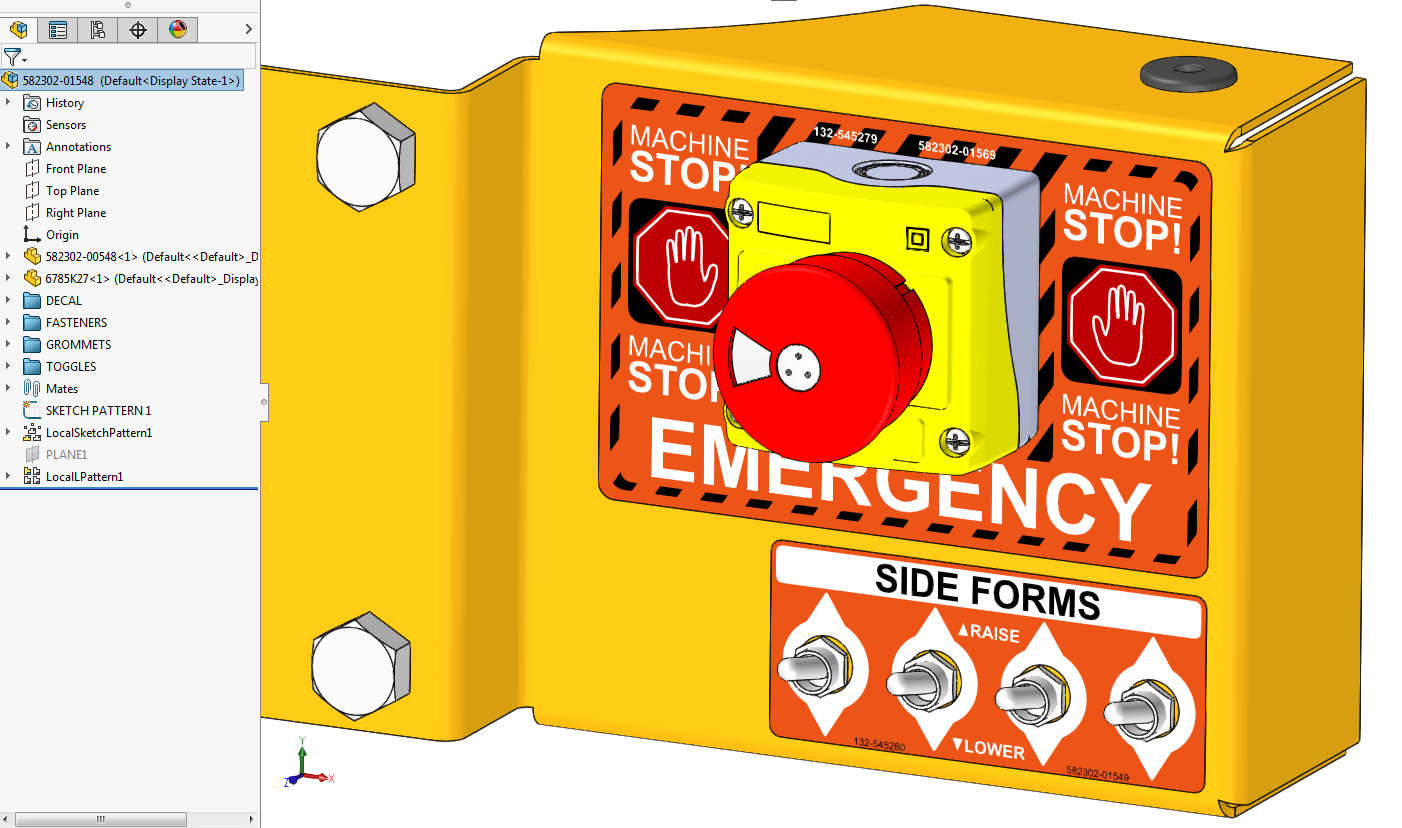
You may be wondering why I’ve included examples on this page of UI/UX work that include landscape architecture instructions and controls panel machine models.
The reason I posted a diverse sampling of UI/UX projects I’ve worked on is because UI/UX goes beyond a device screen. I have experience crafting a range of interfaces and experiences. I’ve learned how to put myself in many users’ shoes, ask questions that a first time user will wonder, and then make products and communications as self-evident, clear, and succinct as possible.
A page of instructions on how to install a sign post in the ground is a User Interface to a sign post installation project.
A warning decal on an emergency stop button is a User Interface to pushing a button to stop a machine in an emergency.
So if you’re wondering why it’s not just websites and screen grabs here, it’s because User Interface and User Experience is more than just screen interaction. A UI/UX designer should be able to think of it in diverse terms and viewpoints to address a diversity of use cases satisfactorily.
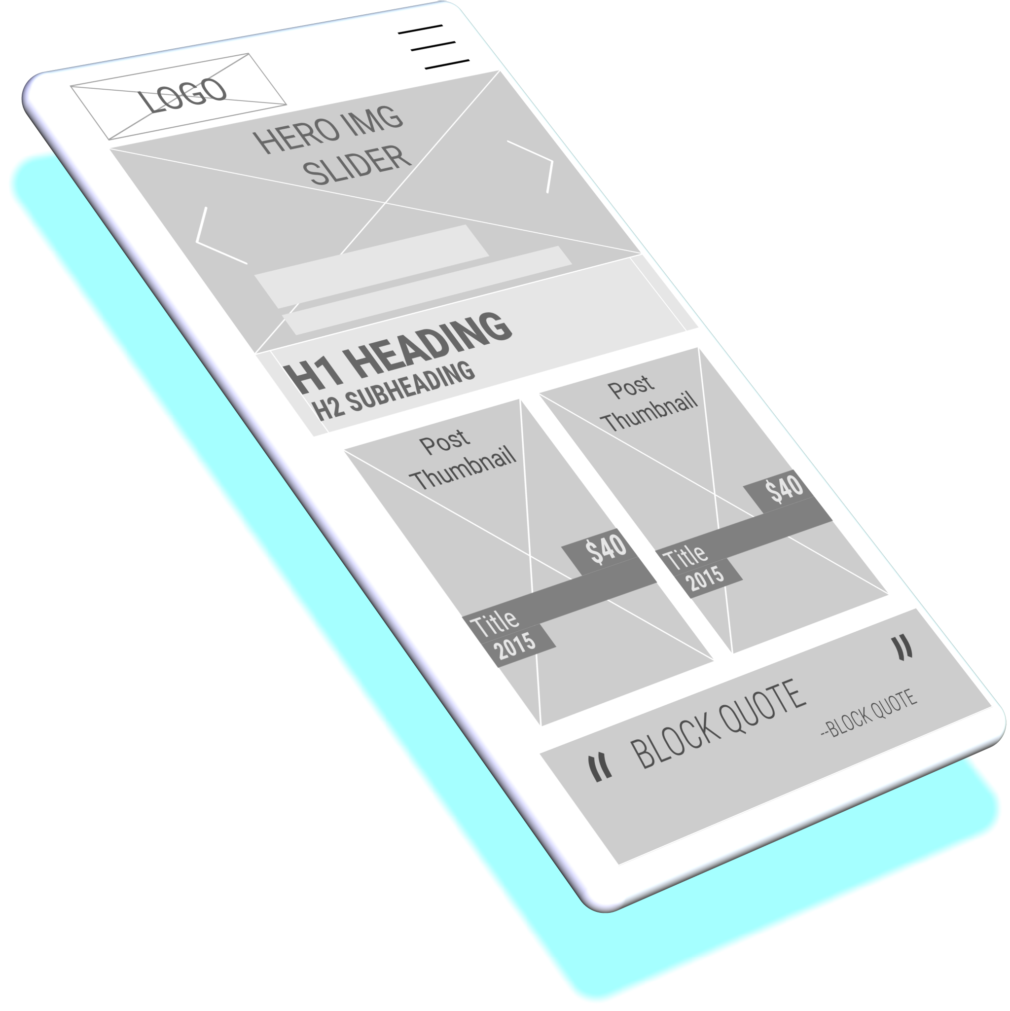
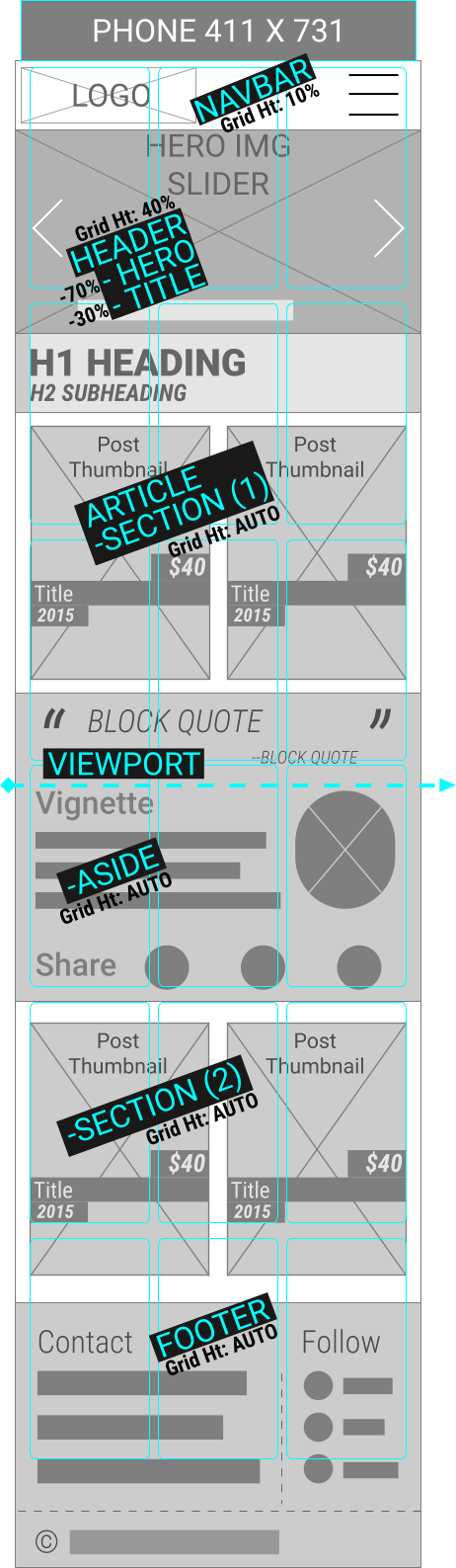
Mobile-First Wireframe
For a website that will list cards of art items for sale, I made wireframes to introduce a design, gather stakeholder feedback, make changes.
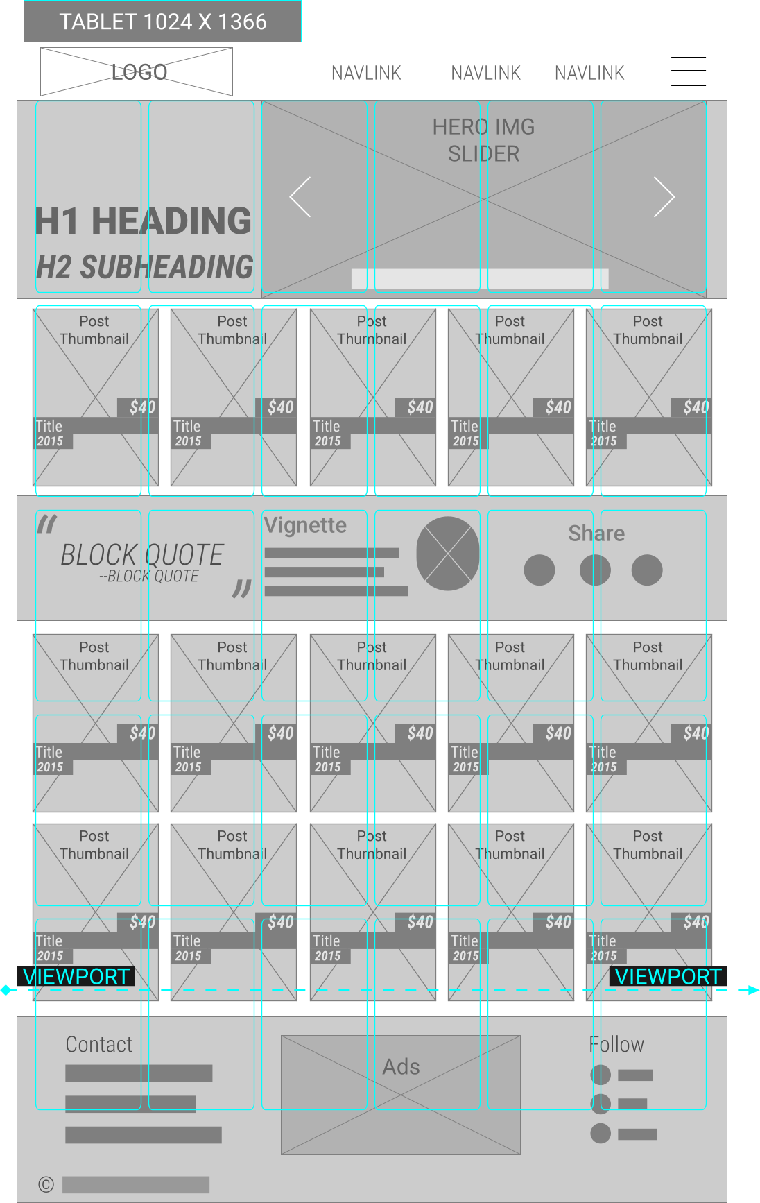
Responsive Visualization: CSS Grid, Flexbox, & Bootstrap
CSS has come a long way. Since I’m often both designer and developer of a front end, I like to turn on the “Grid” overlay in Adobe XD or Figma. This can be dialed in to simulate a CSS Grid Area (including gutters) or the 12 columns of a typical Bootstrap grid. It helps illustrate where the design elements should locate and move across different device viewports in a responsive design.
Mobile-size Wireframe
I’ve come around to mobile-first design practices (when I first learned HTML, there was no mobile Internet). Most sites are visited via mobile viewports nowaday. Therefore: I tend to make designs work and look good on a phone viewport first, then adapt that to a larger format.
Tablet-sized Wireframe
Here’s a tablet-sized (portrait orientation) version of the wireframe.
- It shows how some main navigation links will have room to appear outside the flyout menu,
- and some of the Grid Area assignments will change (triggered by media query),
- and some features of the footer will no longer be hidden.
3D is Key
Making 3D device renderings can be a good way to convey design intent and may generate more enthusiasm from clients or end users who find other mockups too abstract.