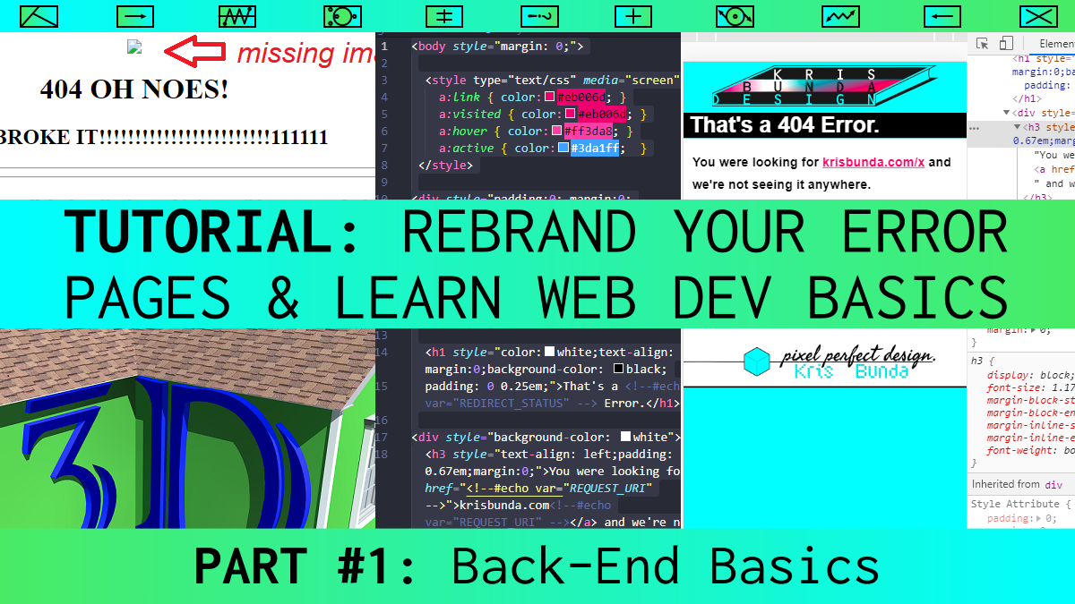
I came across one of my Error Pages and noticed it was missing images and looked bad. They’re fun to customize, and a great 1st-time web developer project. I’ll show you how!
Here’s how to customize your Error Pages–if you have a cPanel hosting interface. Or learn how to code it here, then figure how to deploy it on your non-cPanel hosting account.
Over the course of writing this, it turned into a Beginner’s Intro to Responsive and Accessible HTML & CSS tutorial, so read on if you’re interested in that.
Let’s start with cPanel. Where are your cPanel Error Pages?
First, login to cPanel. It’s in your hosting account when you login, you’ll see something like “Manage your Hosting Account” or “Go to cPanel“. You may not have cPanel as your hosting server admin. You may have a Windows IIS hosting account, or a different admin OS. Even if you don’t have cPanel, the basic HTML & CSS tutorial below still works.
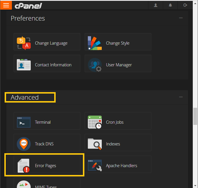
In the Admin Panel, scroll down to the “Advanced” card. Select “Error Pages”.
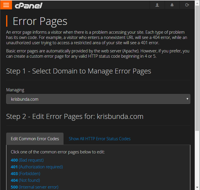
cPanel Custom Error Pages: Step 1
Select which domain you’re editing error pages for (in case you have multiple domains on this hosting account). I chose krisbunda.com for this exercise.
cPanel Custom Error Pages: Step 2
Select which type of error page you want to edit. I chose 404 for this example (and I plan on making code that can be pasted into all the other error types’ pages).
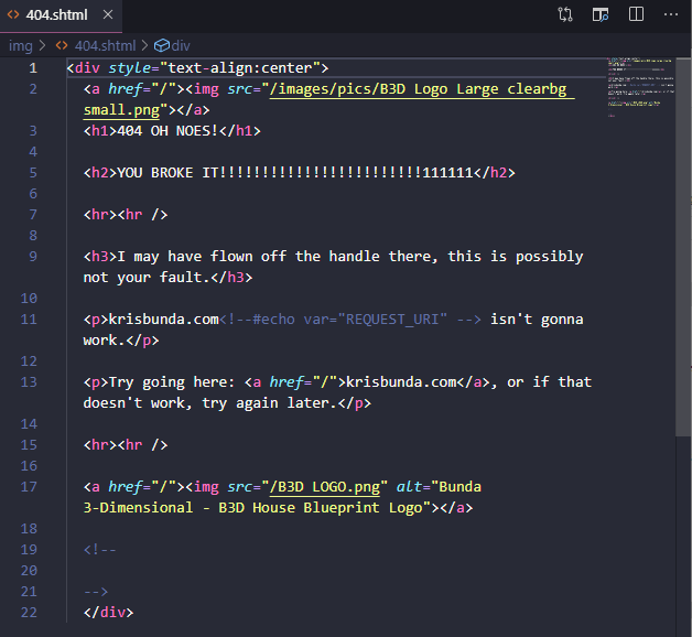
Here’s where you paste your HTML / CSS / JS / etc. for this error page. I edit the code in Visual Studio Code and paste it back here when I want to view it live. It gets tedious, but ever since I started using Cloudflare for this site’s nameservers, it’s made the traditional web development method of uploading code via FTP difficult.
- Notice it is a file named “404.shtml”. The S in SHTML stands for “Server”.
- Also notice the little “Select Tags to Insert” section, with an array of server-side include tags you can add to the page. These are good for making this code reusable, and something that can be pasted into the other error pages with minimal or no changes.

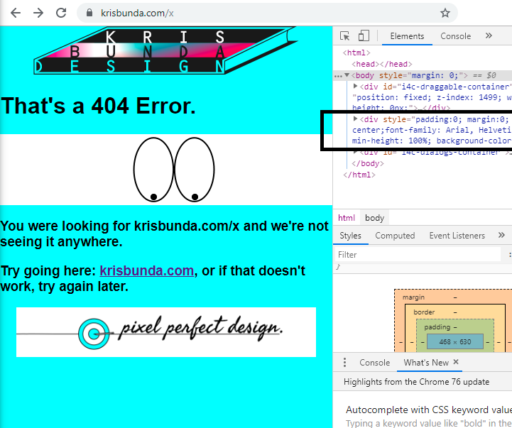
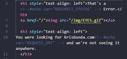
See what the code looked like before–notice the <!--#echo var="REQUEST_URI" --> part. That’s a SSI, and it shows in the error page as the URL that triggered the serving of the error page. I know that sounds circular, sorry. On the page, it reads like krisbunda.com/ Here's the NONEXISTENT FILE URL you entered, no matter what that nonexistent file URL is.
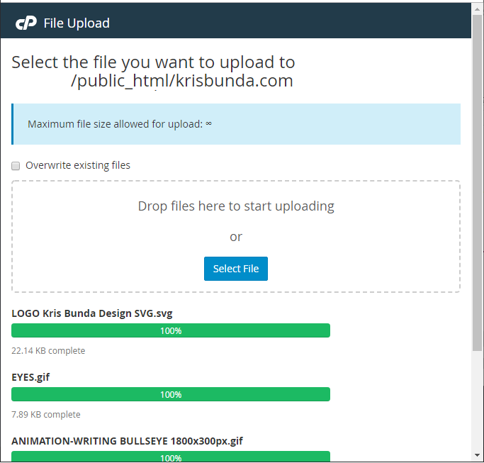
Upload Images (Optional)
If you’re making custom error pages, you probably want to put an image or two on it. I’m going to put three:
- a Kris Bunda Design logo SVG at the top,
- a cartoon eyes animated GIF that’s supposed to be “looking” for the missing file that brought the user to the error page,
- and I’ll put another branded animation at the bottom, because I like it.

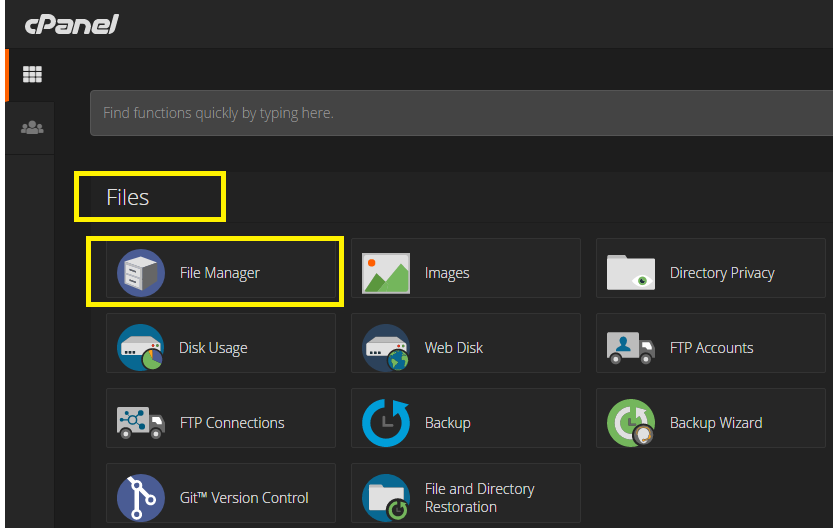
I uploaded image files via the File Explorer utility in the cPanel admin panel:
In cPanel, scroll to the “Files” card, choose “File Manager”.
CSS: Inline Styling
I know inline CSS is supposed to be grounds for a tar and feathering. But I started typing in some styling since this is a simple page and I wanted to get started. We can refactor out the glaring inefficiencies later (like styling multiple HTML elements the same way instead of just giving them a class and styling the class one time in the head of the document).

Elements and Styling them
Wrapper <div>, background-color, font-family
I made an overall “wrapper” <div> as the first div inside the <body> tag. It’s going to set some style rules for other elements inside it. (Child elements will inherit some styles from their “parent” container, or in other words: some styles will “cascade” onto them [CSS stands for Cascading Style Sheets ])
The wrapper <div> has an aqua background-color and Arial font family (or any sans-serif fall-back choice of the device if the user doesn’t have that font installed).
Element Styling and Hyperlinking
<img> size & max-width, and image-as-link <a href>
I want the logo image to link to the home page (all the images do).
Link text is “anchor text,” which is where the “a” comes in.
href stands for hyperlink reference.
E.g.: <a href="/some-url">Text you see on webpage</a>.
And that’s going to look like this on the rendered page: Text you see on webpage.
I want the logo image to be 500 pixels wide if it has the room, or 80% the width of its parent container if less room.
Images are placed using an <img> tag with src="/some-url" syntax. I’ve added inline styling to this image element tag using style="" syntax.
<img style="width: 500px; max-width: 80%; margin: 5px 0;" src="/img/LOGO Kris Bunda Design SVG.svg">
Styling “Responsive Behavior”
Image Size: In this example, the image should display at 500 pixels wide, or no larger than 80% the width of the <div> container it’s in.
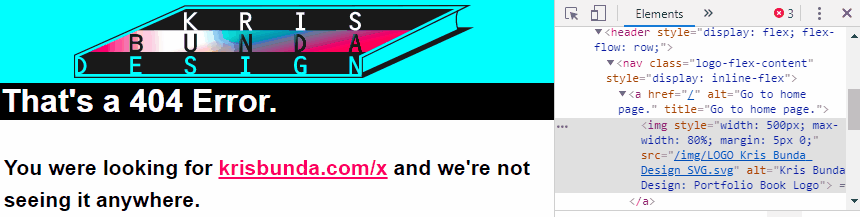
Responsive Design: Being able to have elements scale up and down gracefully, so as not to display ridiculously large or small regardless of screen size or orientation, is a tenet of “Responsive Design”. You can go to krisbunda.com/x and shrink the width of your browser to see this in action (or look at the GIF animation above).
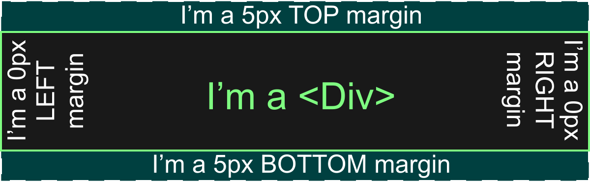
Margin: I also styled the image to have a top and bottom margin (invisible spacer) of 5 pixels, and side margins of 0px, or: style="margin: 5px 0". You’ll get to know “shorthand” tricks like this if you keep learning CSS. The non-shorthand version would be: style="margin: 5px 0 5 0". I think of div border attributes as the cardinal compass points, starting with North (Top Margin, 5px wide) and going clockwise through East (Right Margin, 0px wide), and so on. Just remember: Start at Top, Go clockwise.
Where’s the file? Image Source. <img src=”/some.png”>
I know we touched on this above, with hyperlinking an image, styling an image, and knowing the URL address of your image, which is its “src”… So let’s bring it on home again by telling the server where your files are located (their URLs or sources), and then let’s put it all together, source, link, and styling.
The <img> tag must also show where the image file is located using source syntax, as in: <img src="https://your_site.net/photo_name.jpg">
Finally, here’s what the whole <img> tag wrapped in an <a> tag (anchor or hyperlink) might look like:
<a href="/">
<img style="width: 500px; max-width: 80%; margin: 5px 0;" src="/img/LOGO Kris Bunda Design SVG.svg"></a>
Note there are 4 important parts here:
- The link element
- The image element (nested inside the link element)
- Style attributes (inside the image element)
- Source attribute (inside the image element)
Notice the 2 Server-Side Includes in the code!
One for REDIRECT_STATUS and one for REQUEST_URI.
“Error Number” SSI Code
REDIRECT_STATUS is responsible for the “404” in the <H1> headline title “That's a 404 Error.” Why? Because then I can paste that code in all error pages, and they’ll all correctly say “That's a [correct code number; like 400, 500, 403, etc.] Error.” One of the tenets of programming is “DRY: Don’t Repeat Yourself“. If I can reuse the code we write for the 404 error page on all the other pages, then let’s do it.
“Error URL” SSI Code
The REQUEST_URI SSI code will inject the URL (without domain) of the file path that triggered serving the error page to the user. I like using this because it tells the user exactly which URL is probably no longer available to them, so hopefully there’s no confusion. The message I added says “You were looking for krisbunda.com/some URL and we're not seeing it anywhere.” Honestly, I don’t see why this isn’t reusable for most other error pages also. That’s my goal, one page of markup/styling, reused on all error pages.
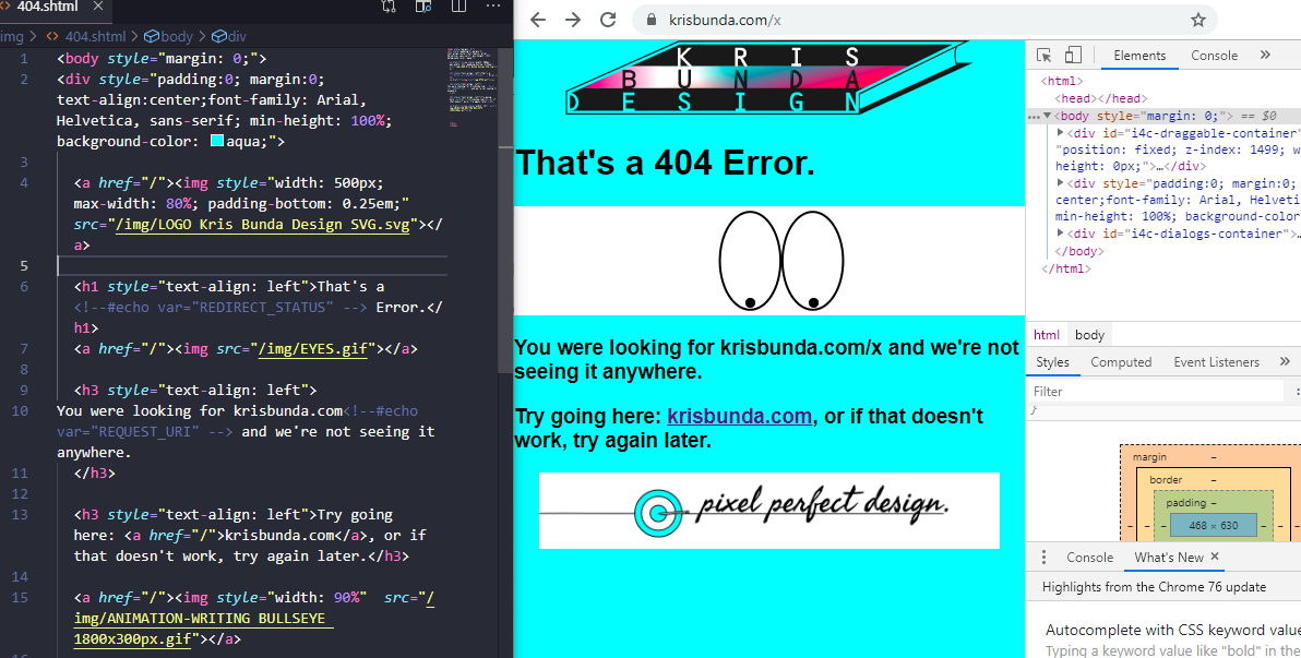
How we’re looking so far... I’ve got:
- a text editor/IDE on the left (Visual Studio Code),
- the error page in the middle,
- and the Chrome “Dev Tools” panel on the right,
- Dev Tools helps me inspect elements of the site and styling I’m creating (and figure out why when something looks an unexpected way.)
That’s Part 1: Backend Basics
I’m noticing this is getting very lengthy. This looks like a good spot to end a Part 1 of this “Customize Your Error Pages while Learning Beginner Web Dev” blog, which now looks to have been about Backend Basics (getting into cPanel, uploading assets, learning about SSIs).
Part 2 will be published shortly, and will get more into Basic HTML & CSS. Probably touch on cross-browser and cross-platform testing to see if the User Experience you’re trying to present is consistent for most users. On that note, let’s show how CSS Preprocessors work to help you on that regard.
Part 3 will be after that, with a focus on Responsive Design, like Flex Box, Grid, and Viewport Breakpoints. Oh, and creating various sizes of visual assets for browsers to serve to people who don’t want to burn their data plan on 8K RETINA EVERYTHING.
Part 4 will be simply Refactoring, or rewriting code to make it neater, more DRY (Don’t Repeat Yourself), and maybe add some notes in for Future You who discovers shamefully outdated error pages and wonders what Past You was even thinking.


install epson printer
I really appreciate the efforts you put in this article, this is very informative and helpful. I really enjoyed reading this blog. Keep sharing and give us updates.