My Animated Analogy comparing information systems planning documentation scenarios: Detailed Use Cases (text only) vs. Casual Use Cases + Data Flow Diagrams (graphical).
Recently we had a forum discussion on different documentation methods for planning a software development project, specifically this scenario:
One team lead feels writing detailed “Fully Dressed” Use Cases alone will be sufficient to plan and scope a project. But another lead feels it’s important to write basic “Casual” Use Cases and then also write or retrieve Data Flow Diagrams (DFDs) for each UC not already diagrammed.
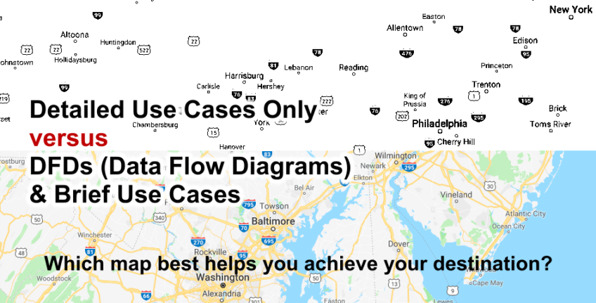
In considering this scenario–which I suppose is a management philosophy issue, but also impacts development, quality assurance, and other project aspects–an analogy occured to me. I posted the images below to the discussion forum, where I took a Google Maps screenshot, cropped it and saved a copy, of which I removed all color tones and symbolic features other than city and highway markers.
The comparison of the 2 graphics is an analogy comparing 2 information systems project documentation techniques scenarios to 2 roadmaps. One graphic is a traditional roadmap that has visual features and is therefore functional and useful. The other graphic is a “road map” with only text, which is not very useful, and would make the user take much longer to get from point A to point B since there would be less instruction.
In Scantron test format:
DETAILED USE CASES ONLY : (is to) CASUAL USE CASES + DATA FLOW DIAGRAMS (DFDs)
:: (as)
TEXT-ONLY ROAD MAP : (is to) TRADITIONAL MULTICOLOR ROAD MAP
For this analogy:
- On one side: if a person or team just wrote a bunch of fully-dressed use cases (text-only).
- On the other side: taking casual use cases and combining them with graphical flowchart-style diagrams (DFDs).
“This thing reads like stereo instructions…”
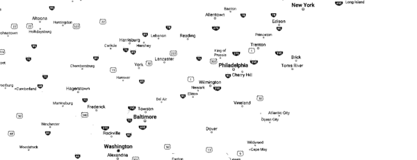
What would a collection of long-form use cases look like to me? A book of stereo instructions. Or a road map with no roads, only black & white text. No compass rosette and no geographical features–like mountains, lakes, borders. In other words, you know places and things exist because you can read their names, you just don’t clearly visualize how to get to them or how they connect to each other.
Places to go… and how to get there
On the other hand, if you had a book of brief use cases, with each important use case paired with a Data Flow Diagram, I feel like you’ve then given a development team a true road map on how to get to solutions… or at least illustrate which roads will need to be travelled to deliver the correct information to the end user.
So really, the reason I side with the 2nd scenario is I believe visual aids (in addition to text) help instruct and inform people faster and better than text alone. I’m also a fan of work that can be reused; DFDs could be reused to visualize similar functions of other future projects, and developers could use the diagrams as a workflow checkoff sheet and how-to coding roadmap to complete tasks after they’ve already been used in planning and scoping stages of the project.
Map with colors, lines for roads, geographic features
Here’s the animated Gif version of my analogy (if not displaying, click the image placeholder below, it may animate then):
In case you need a refresher:
Use Cases: What are “Fully Dressed” vs. Casual?
I’m just going to copy some explanations from Wikipedia.
First, let’s look at what may constitute a longform, or detailed, or “fully dressed” use case:
Fully dressed
Cockburn describes a more detailed structure for a use case, but permits it to be simplified when less detail is needed. His fully dressed use case template lists the following fields:
- Title: “an active-verb goal phrase that names the goal of the primary actor”
- Primary Actor
- Goal in Context
- Scope
- Level
- Stakeholders and Interests
- Precondition
- Minimal Guarantees
- Success Guarantees
- Trigger
- Main Success Scenario
- Extensions
- Technology & Data Variations List
In addition, Cockburn suggests using two devices to indicate the nature of each use case: icons for design scope and goal level.
Cockburn’s approach has influenced other authors; for example, Alexander and Beus-Dukic generalize Cockburn’s “Fully dressed use case” template from software to systems of all kinds, with the following fields differing from Cockburn:
- Variation scenarios “(maybe branching off from and maybe returning to the main scenario)”
- Exceptions “i.e. exception events and their exception-handling scenarios”
And casual use cases:
Casual
Cockburn recognizes that projects may not always need detailed “fully dressed” use cases. He describes a Casual use case with the fields:
- Title (goal)
- Primary Actor
- Scope
- Level
- (Story): the body of the use case is simply a paragraph or two of text, informally describing what happens.
Now let’s paste an explanation of Data Flow Diagrams (DFDs) from Wikipedia:
Yeah, that’s really lacking. But I do like Wikipedia’s current comparison of physical vs. logical diagrams:
Physical vs. logical DFD
A logical DFD captures the data flows that are necessary for a system to operate. It describes the processes that are undertaken, the data required and produced by each process, and the stores needed to hold the data. On the other hand, a physical DFD shows how the system is actually implemented, either at the moment (Current Physical DFD), or how the designer intends it to be in the future (Required Physical DFD). Thus, a Physical DFD may be used to describe the set of data items that appear on each piece of paper that move around an office, and the fact that a particular set of pieces of paper are stored together in a filing cabinet. It is quite possible that a Physical DFD will include references to data that are duplicated, or redundant, and that the data stores, if implemented as a set of database tables, would constitute an un-normalised (or de-normalised) relational database. In contrast, a Logical DFD attempts to capture the data flow aspects of a system in a form that has neither redundancy nor duplication.
Someone wrote a good point about DFDs there: They can both describe the processes and functions data must take to provide useful output in computer program development (logical) OR they can describe, for example, the data points that must be presented on a report printout from a business application (physical). Both of these are very useful.
Diagram!
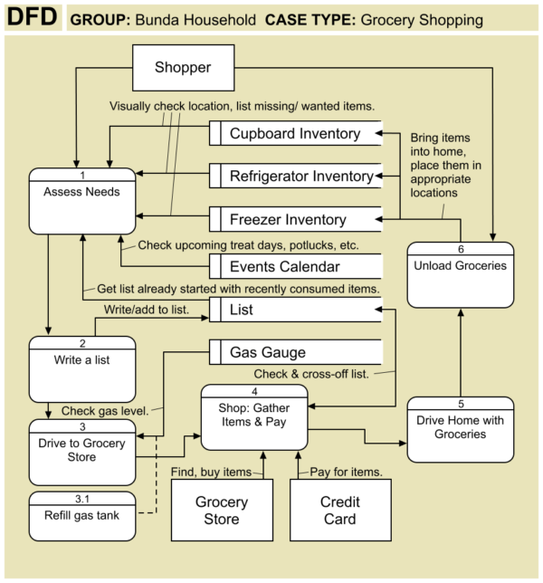
I didn’t see what I consider a good example of a DFD on Wikipedia, so here’s a sample I made of a DFD of a possible grocery store trip for my household:
That’s a Rant.
Well, that’s my piece on a few information systems documentation types. If you also have opinions, feel free to post comments.






Leave a Reply about how this blog changed your life.