4 Things To Do to Make Graphic Images Look Good at Larger and Smaller Resizings
Things I’ve figured out the hard way about making raster images that look decent at largely different sizes.
- 1.) Make your images LARGE. The whole 1st part of this post was about this, so I won’t reiterate. One other thing to say is: For page loading speed, Google PageSpeed Insights will constantly harp on you to serve images sized perfectly for the viewport so as not to waste a single bit of information transfer. But I argue that shouldn’t be your responsibility. Let a CMS take your large image and create several smaller versions of it to serve, and further, a plugin can “lazy load” and resize it more from there.
- 2.) Make your outlines and/or borders thick enough to be smoothed (averaged) by anti aliasing GPUs, and your graphics program
. A one-pixel line is hard to bend into an arc without stair-stepping. 2 or more pixels gives more area to average out the edges and feather them into a gradation. But then you must consider image resizing. A 2px-thick line on a 128px-wide image might smooth nicely, but that probably means on the original 1920px-wide image, that line is natively 30px wide! So when you think you’re done with your graphic, make several resizes and view them next to each other to see what happens upon scaling down. This may send you back to the original-sized graphic to tweak line sizes.
1.) Border thickness. With an already-thin font, the artist may have considered not having an outline border at all…
2.) Border color. If you’re going to 2-tone your text, make sure the color ADDS to legibility. After all, you’re trying to get a message across. (more on line color on the next Tip).
3.) Font selection. Already mentioned that the font is thin. With narrow-style fonts, they already can be difficult to read. Don’t confuse their lines anymore than necessary, or you risk your message turning into mere noise and ignored.
4.) Tilted (angled) lines. This is like the anti-aliased diamond mentioned above. Angled or curved lines are already prone to stair-stepping. Diagonal lines are unavoidable, but realize where they make you vulnerable to pixelating your message, and design accordingly.
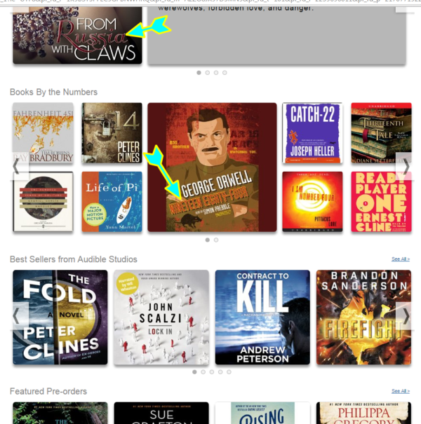
 1984 cover image
- 3.) Play with the colors. Make sure your lettering and background outline colors are playing nice with each other. Every graphic will probably have some high-contrast lines on it, there aren’t many light-gray-on-white logos. Line art by its nature is often black lines on white, you don’t contrast more than that. Depending on how much freedom you have with the color scheme, play around with what looks better – dark on light or light on dark? Blue with yellow outline or blue with gray outline? It may just be a psychological trick, but perhaps that GoDaddy oval logo would’ve looked less jagged if it were dark strokes on light background?
As sort of a “sub-tip,” let’s talk about testing workflow.
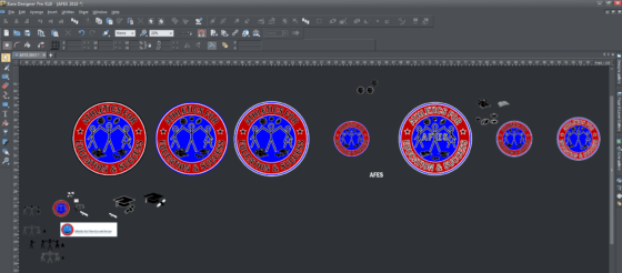
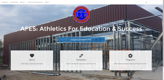
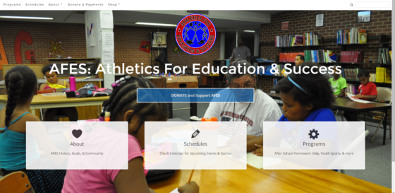
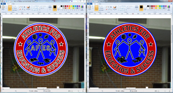
Here’s some screenshots of how I might start testing graphics.
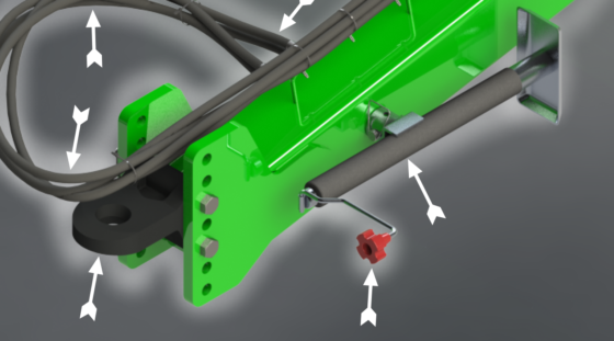
- The first image: My graphics editing software may start looking a little obsessive when I’m testing different elements, border sizes and colors on a graphic. It’s a “sandbox,” use it as a place to make a lot of copies so you can choose the best iteration. Find what works.
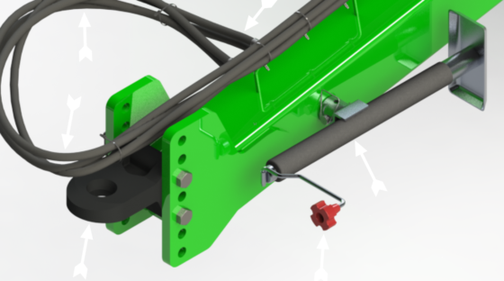
- The other images show how I may start testing assets “in the real world” (read: a temporary website I set up on a subdomain). Let’s see how they look in different places, on social media; web pages on desktop, tablet, phone viewports; email templates; Print some out to see how they do on forms and documents (a grayscale version may have to be made); etc.
- 4.) Transparent background? Consider adding a halo around the edge of your graphic. It sometimes makes sense to add a light-colored background or outline to the overall image. I call this a “doily
“. This especially makes sense if your image’s border has arcs or diagonal lines, or for some reason there’s already a light-colored “halo” artifact around the edges (happens when you make a photorealistic rendering and then remove the background to overlay onto a new setting; Also happens, annoyingly, on export from some image processing programs
).
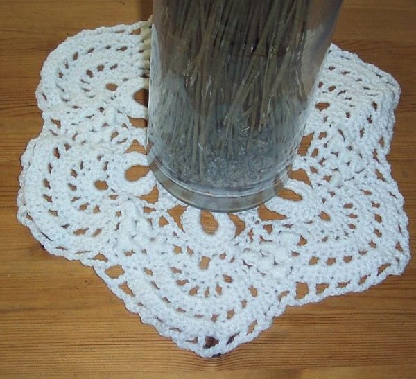
If you’re trying to get those little white edge pixels that are so-small-yet-so-distractingly-noticeable, sometimes it’s easier to just add a deliberate thick white or light-colored border line that blends them out. The “If ya can’t beat ’em, join ’em” strategy.
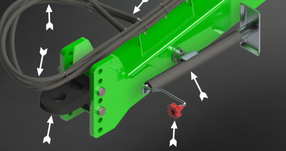
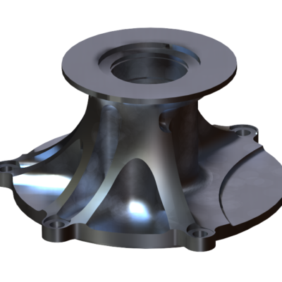
Here’s a rendering I made, and it has a light-reflection halo around the edges that’s hardly noticeable until you either have a really dark background behind it, or it’s scaled down or enlarged. But those things tend to happen on the internet or with digital copy. So here’s how I blend it out:
If No Doilies Allowed:
Otherwise, if not appropriate to use white borders as a trick for handsomely setting transparent-background overlays, I have to try to:
- Select all the similar-colored (unwanted) pixels in Photoshop
/GIMP
and repaint/airbrush them a less apparent color around the edges of the graphic;
- Or select them and then delete them, but that often backfires;
- And/or, use smudging or blending tools around the edges, but it’s time consuming and can easily start looking as garish as lighting artifact pixels.
Sorry guys, not every PNG can set on a doily.
What’d I miss?
There’re a lot of opinions and subjective tastes in the perception of graphic artwork. I listed 4 suggestions for making better graphics that will withstand some of the twisting and pulling that happens to images when they leave your editing program and are flung out into the world. If you have other tips or opinions, comment or email.





Leave a Reply about how this blog changed your life.