Blast From the Past
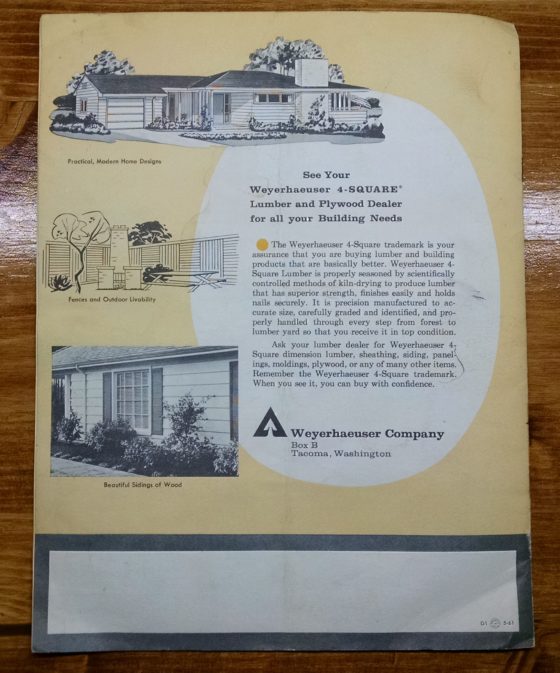
I found these 2 brochures from the 50s or 60s (not sure of dates, but you can tell their period from the heavy use of sans-serif fonts, and mid-century kitchen and home designs).
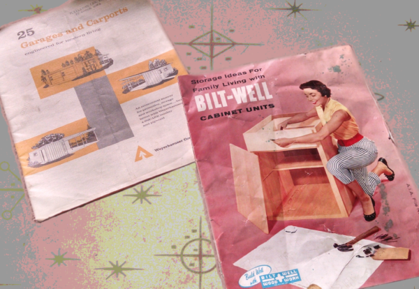
Say! Shouldn’t You Park Your Edsel in a Nice, New CARPORT?
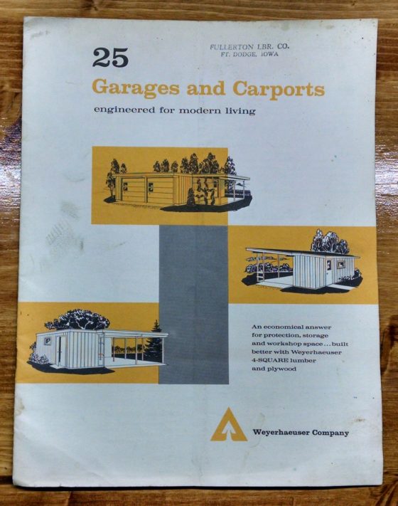
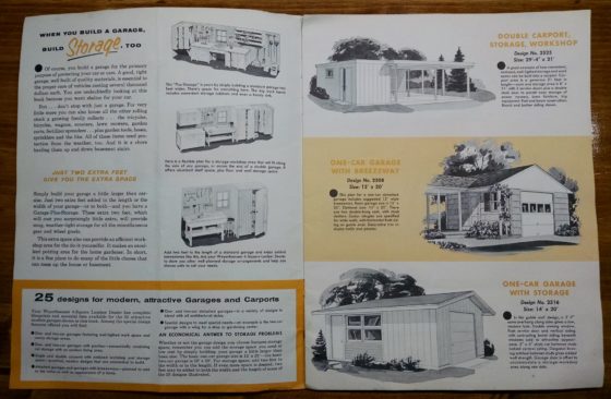
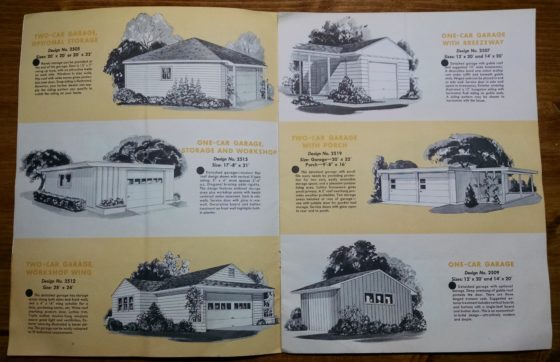
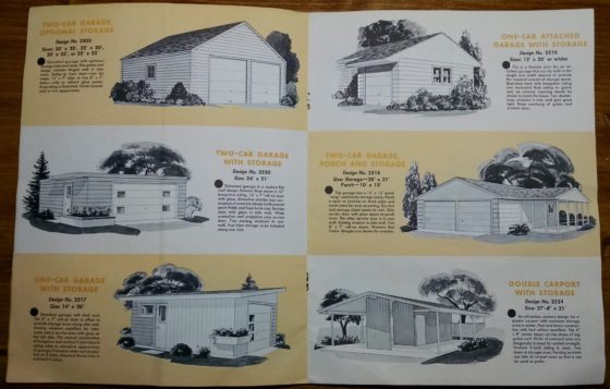
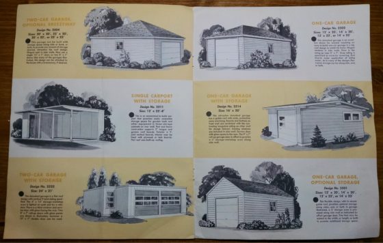
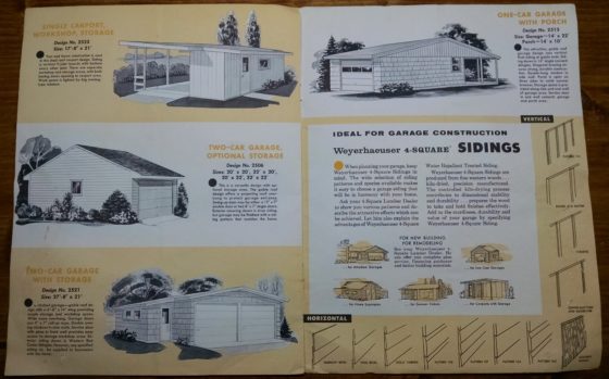
Enjoy these pages from a Weyerhaeuser garage and carport promotional brochure, which apparently aimed to sell more of its core business lumber products by providing building plans. With visually stimulating renderings of sample structures in light gray and mustard motif, I’m surprised there’s a forest left in North America. 25 Garages and Carports: engineered for modern living.



Alex Campos
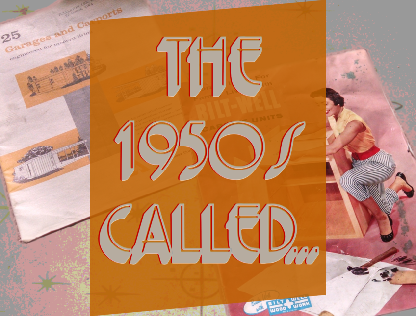
Howdy! Cool post. I was curious about the font that’s used the main image (“The 1950s Called…”). I’m a student and I’m looking all over for type options for a project, and this one looks like a contender. Appreciate any help!
Kris Bunda
Hi Alex, Sorry I didn’t see this sooner. I actually spent a while looking for the font and couldn’t find it… Searching for terms like “Gothic, art deco, sans serif, display, 3D font” etc. The problem is, this font must have been on my old computer and not this. I also wondered if it was a case where the font was originally just the thin line, and I used my graphics program to thicken the border, pull a 3D effect down (or same colored drop shadow) and then make the original font transparent, but I think the font actually looks like this… My graphics program said it’s searching for a font called “primer” but I think it’s wrong, not sure why.
I hope that helps. Also, maybe try downloading the image, crop to just the “THE” word, drop it in a google image search, and maybe it will find a similar “THE QUICK BROWN FOX…” image on the internet?