WELCOME! To the Kitchen Of The FUTURE!
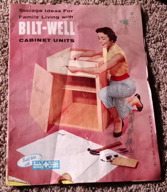
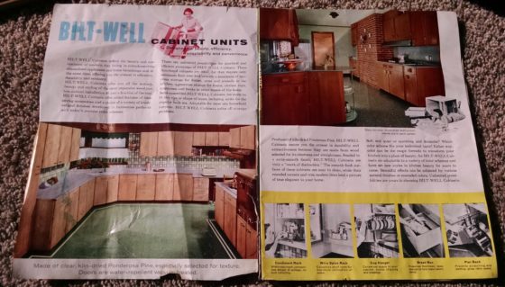
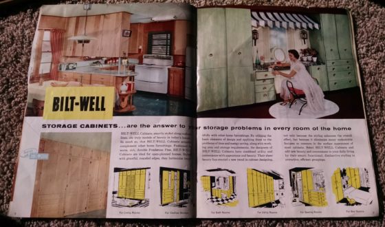
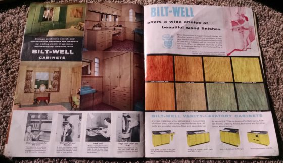
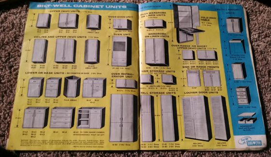
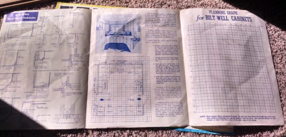
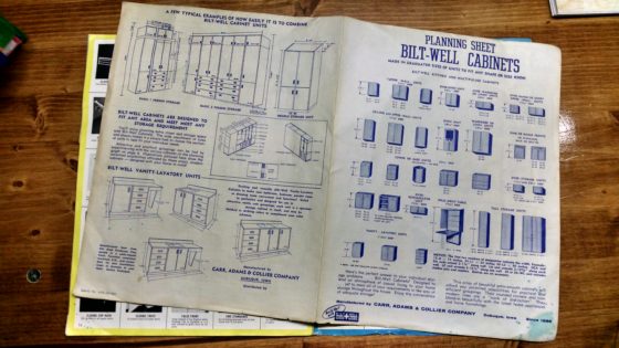
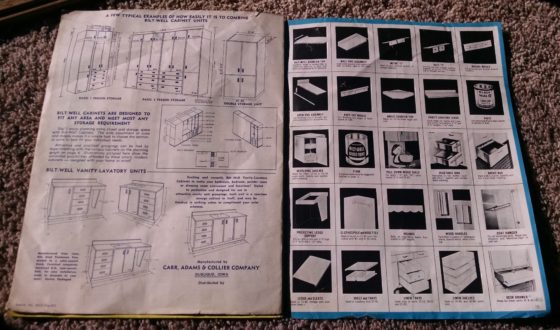
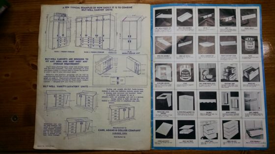
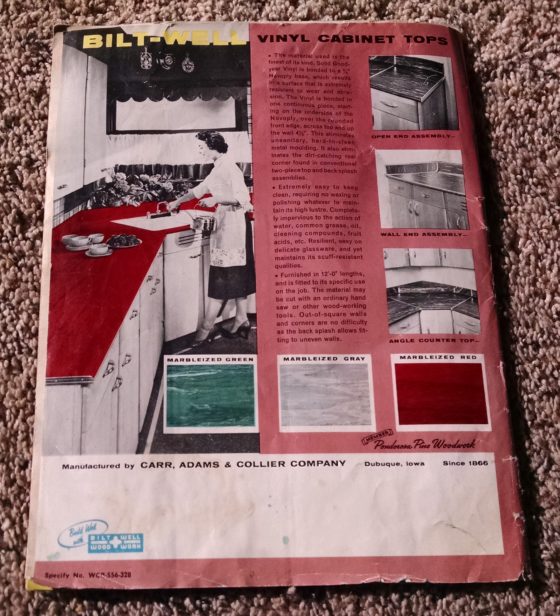
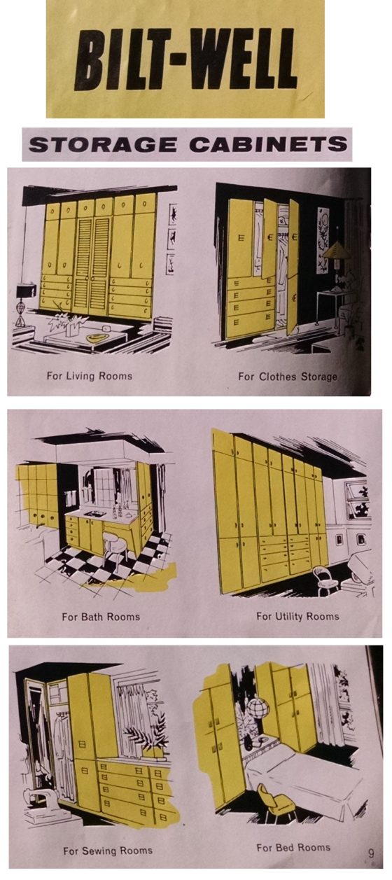
The other brochure is of Bilt-Well Woodwork’s Storage Ideas For Family Living with Bilt-Well Cabinet Units.
RoseBilt-Well
Similarly-styled cabinets have furnished kitchens in many homes I’ve visited, especially when I was a child.
The farmhouse I grew up in was built in the late 1890s (it’s since bulldozed and burned, literally scorched earth). It had a couple of what I assume were original kitchen cabinets, painted so many times their wonderful small turning-knob latches could hardly catch on a humid day, since the doors barely fit in their paint-tight jambs.
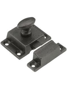
 Similar to the Late 1890s kitchen cabinet door knob latch hardware – but covered in many layers of cream paint
All the rest of our cabinets were an apparent remodel in the 1950s. I’m an A-sentimentalist; nostalgia is a waste of time. But the kitchen images from the brochure take me on a trip down memory lane (simply remembering is different than nostalgia).
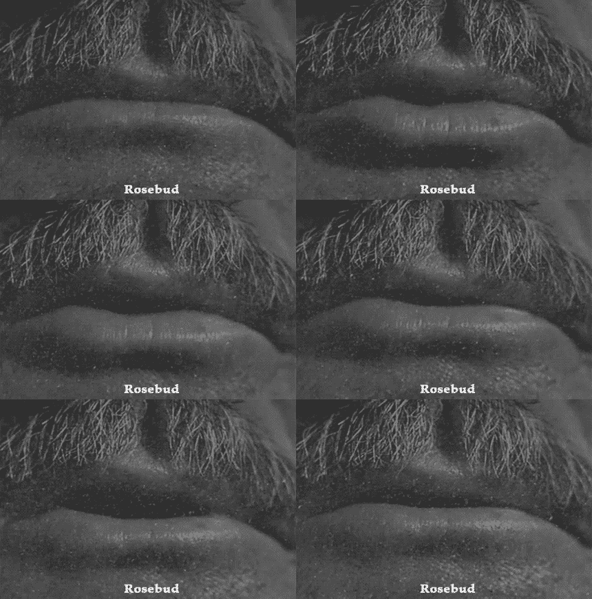
 Citizen Kane: I have more money than god but can only obsess over childhood memories of a sled.
Here’s where I go into my Don Draper Carousel Pitch (but about old cabinets)
(It’s okay if you run out of the room crying like Harry)
I remember how certain hardware functioned, how once-fashionable materials looked and felt. The thin-but-solid wood cabinet door with a magnetic catch and large, thin-edged saucer pull opened and closed differently than today’s heavy-framed cupboard door with cam hinges, soft-close felt pads, and rounded brushed-nickel knob pull.
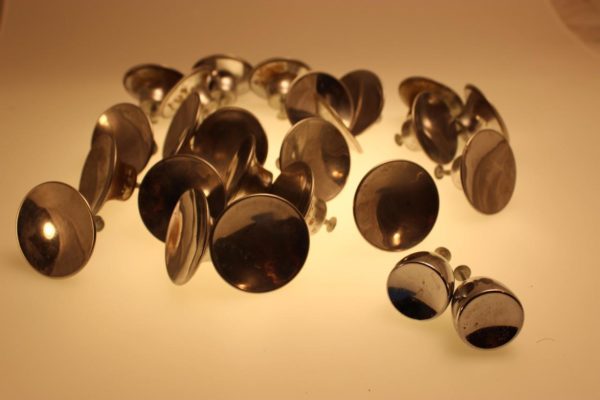
 1950s Round Cabinet Pulls – 2in Dia Concave Dished
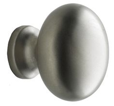
 Contemporary heavy round brushed-nickel cabinet pull
What’s Old is New[ly marketed] Again!
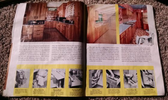
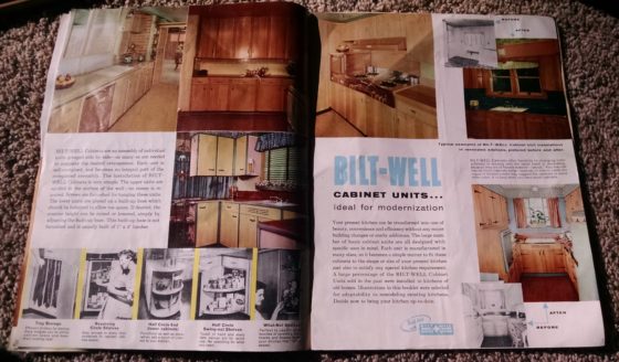
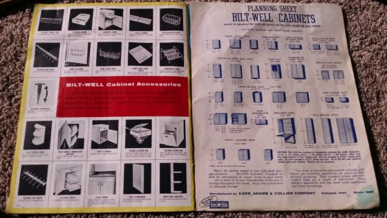
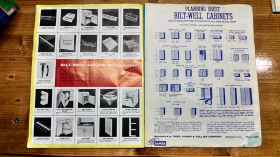
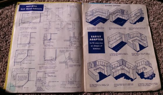
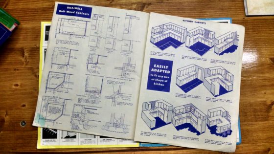
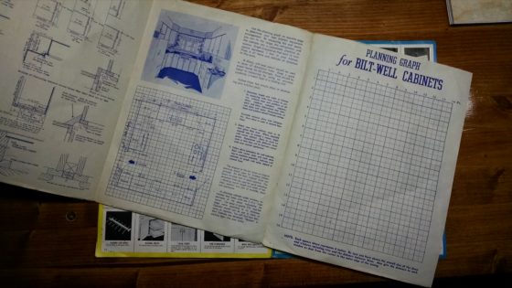
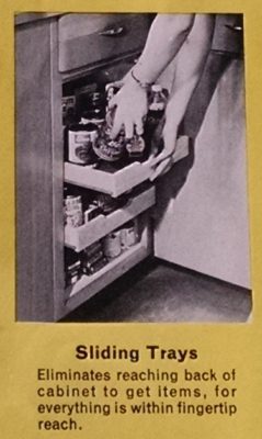
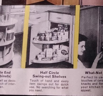
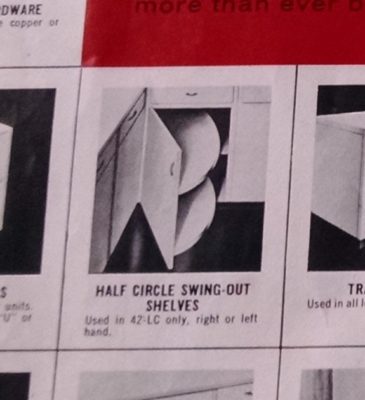
One thing that really surprised me about the Bilt-Well book were all the mechanical accessory upsells offered. I was under the impression the telescoping lower drawers and corner-cupboard half-circle shelves were recent inventions, of the last generation or so. (I love watching This Old House, and at least once a year they show off some kitchen remodel options).
I guess I took some of today’s home improvement marketing to mean cabinet technology was suddenly achieving advancements à la Television’s leap to 16:9 ratio x 1080p resolution after 50 years of 4:3 x 480. But no, just because your salesman touts how wonderful color television is doesn’t mean it’s new technology.

Aside:
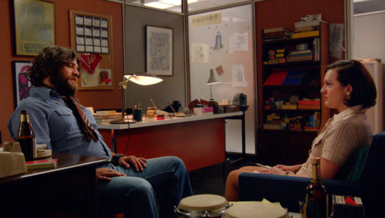
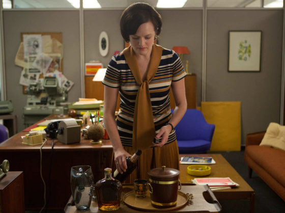
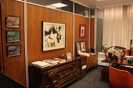
Putting “Mad Men” in the title of this post may seem like shameless click-baiting or something, since the brochure designs are real midcentury work and that’s a contemporary show derived from the aesthetic of the time. But that show’s been done for a while, I’m not really hitching my wagon to it, as it’s not like I can still hit that series finale wave of Google searches.
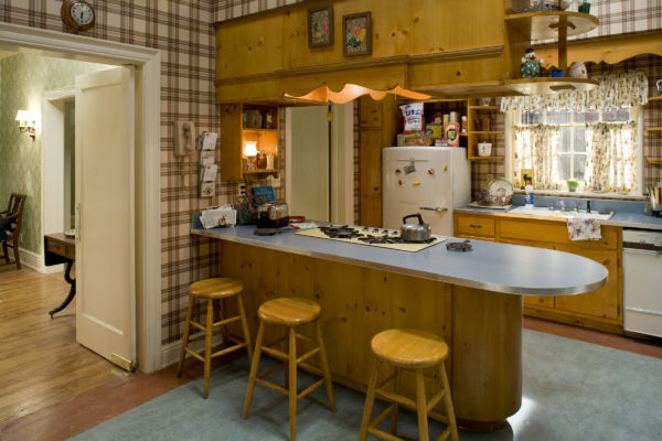
I just like that show. I’ve loved the style of midcentury modernity since I was young–from graphics to furniture to architecture. And I think now, in many people’s minds who know both the show and love that period’s design, the two things are interlocked. Mad Men has brought the art to life. It occurred to me while looking at the pages, and wondering about the layout techniques designers had to use decades before PCs; the people who made these layouts probably smoked cigarettes in their offices while making this work product. The point is, I was thinking about the people who made it, not just flipping through an old brochure.
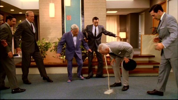
These brochures aren’t only of a different time and style, but of a different culture and society. Where I live, grocery stores still had ashtrays at the ends of aisles in the late ’80s. Smoking wasn’t outlawed in bars and on public grounds until nearly 2010. Those cultural conditions, of walking into a store and standing next to a smoking person, seem so strange–and they lasted until relatively recently!
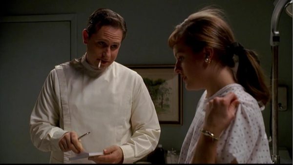
I doubt we’ll find out who made the brochures’ graphics, photos, copy, layouts, direction, proofs—or whatever all went into their production. We won’t probably know if they worked in-house or on Madison Avenue (planet earth or the rings of Saturn). They’re probably mostly dead. But that I’m even wondering about their lives is because Mad Men made aged production art the actual achievement of working humanity, not just attic trash which offers the passing curiosity of period-style exhibition when it occasionally sees daylight. People woke up, dressed, and arrived at work to make decisions, art, and these documents.




Alex Campos
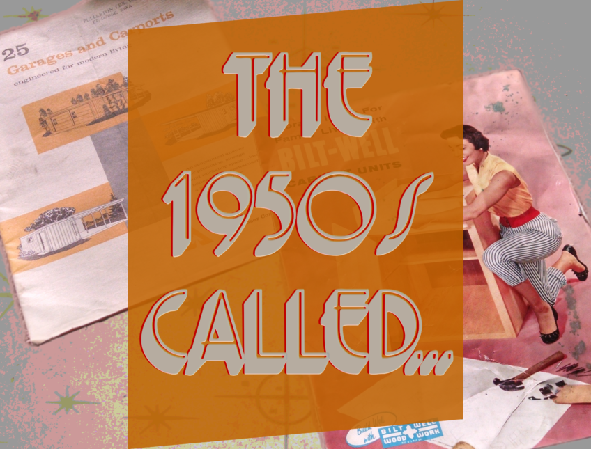
Howdy! Cool post. I was curious about the font that’s used the main image (“The 1950s Called…”). I’m a student and I’m looking all over for type options for a project, and this one looks like a contender. Appreciate any help!
Kris Bunda
Hi Alex, Sorry I didn’t see this sooner. I actually spent a while looking for the font and couldn’t find it… Searching for terms like “Gothic, art deco, sans serif, display, 3D font” etc. The problem is, this font must have been on my old computer and not this. I also wondered if it was a case where the font was originally just the thin line, and I used my graphics program to thicken the border, pull a 3D effect down (or same colored drop shadow) and then make the original font transparent, but I think the font actually looks like this… My graphics program said it’s searching for a font called “primer” but I think it’s wrong, not sure why.
I hope that helps. Also, maybe try downloading the image, crop to just the “THE” word, drop it in a google image search, and maybe it will find a similar “THE QUICK BROWN FOX…” image on the internet?