I submitted this to a discussion forum and decided to post it here also, since it’s both about digital design stuff [HCI (Human Computer Interaction), ID (Interaction Design), UI (User Interface), UX (User Experience)], and also a rant on why I like using a certain app to find new music for my DJing hobby.
The reason I feel strongly about YouTube for song discovery is because I’ve been a long-time user of such algorithm-led music recommending apps as Pandora, Spotify, SoundCloud, and even the specific electronic music sales outlets, like Beatport and a couple that I don’t think exist anymore. None of them have given me as many rewarding suggestions per listening session as YouTube, which is ironic considering how long I resisted using it to listen to music–I remember years ago my wife saying how people listen to YouTube for hours–I thought, “What a waste of bandwidth–To play video when you only want audio!” But the algorithm and the UX set YouTube apart from the audio-only others that should be better at finding new songs I’ll enjoy.
Here’s my repost:
Consider a human-computer interaction with which you are familiar.
Describe types of interactions between user and computer, explain how these are part of the overall process and user experience.
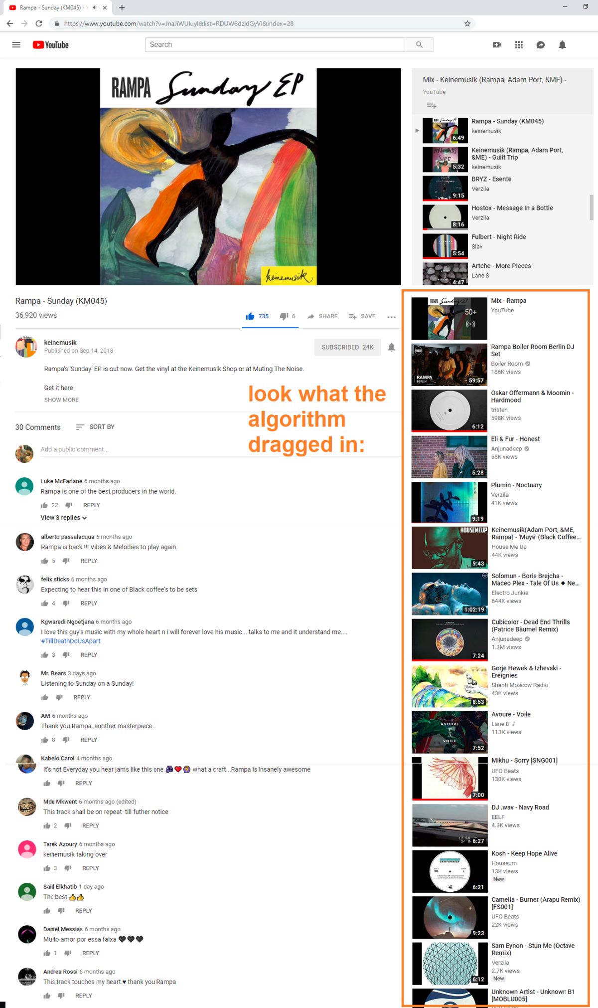
The interaction I want to discuss is with YouTube, specifically; listening to and discovering new music on YouTube. YouTube helps me find new music for house mixtapes (my amateur hobby – https://www.mixcloud.com/KrisBunda/) because it has an algorithm that makes suggestions based on videos for songs I previously indicated an appreciation for.
Other than the basic YouTube UI of video playback buttons, the interactions I feel create a memorable and rewarding user experience are the ones that present tailored choices to me.[1]

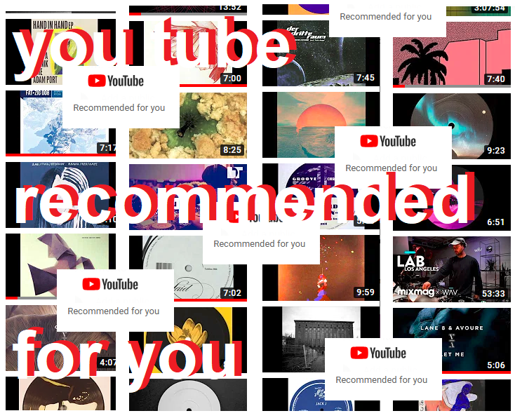
When I go to YouTube.com, (if I’m logged in) I’m immediately shown various video thumbnails that are similar to videos I’ve enjoyed recently. If I select one of them, I’m shown a long list of other thumbnails I’ll likely enjoy, either under the video viewport or on a sidebar card, depending on the browser size I’m using.
Describe how the conceptual model guides the design of the interface and interactions.
Videos have a thumbs up/thumbs down rating system prominently displayed. This tells YouTube unambiguously if I liked a song (an input that may present more suggestions as an output). I can also easily bookmark or save videos in a folder name of my choosing. And there’s a prominent “listen later” button on video thumbnails to save them for later. These are all intuitive functions that help me make choices and easily create inputs, but also create stakes where I’ve invested time and effort into telling the app about my preferences and have amassed files of gathered material there.
Additionally, of the algorithm-produced recommendation video thumbnails, some of them have a text line stating “Recommended for you” next to them. I’ve found these “picks” to be more-often-than-not rewarding to choose.

Another important display of information is the length of the videos, in hours, minutes, and seconds, which is in a small black box in the corner of all thumbnails. This tells me if the recommended video is likely a house song (between 5 and 12 minutes long) or a DJ set (closer to an hour or more in length) or something else entirely. The video title, also displayed next to every thumbnail, aids in selection too, with a typical song title’s format being [a producer name, hyphen, and song title]. If the thumbnail’s title doesn’t stick to this format, it’s a clue I can skip it (e.g.; “How To Make …” or “You Won’t Believe This …” are not songs).
Explain how the interaction types and user conceptual model help to achieve the goals of the application and meet the needs of the user.
All the elements mentioned communicate to me or help me communicate to the app. The conceptual model seems to understand how to help me make my preferences known and then exploit them to provide me with rewarding video choices. This intuitive, rewarding, low-effort, uncomplicated user experience keeps me coming back to YouTube, which is also a win for the app because it means I view more ads, the app’s main revenue source.
[1] Preece, J., Rogers, Y., & Sharp, H. (2015). Interaction design: beyond human-computer interaction (Fourth edition) Table 1.1. Chichester: Wiley.


Leave a Reply